Data visualization is an analytical concept that deals with the look and presentation of the collected data. The data visualization tools are used to present text-based data in a visually appealing manner. It helps the people to visualize and understand the impact and insights of the data. The data visualization tool uses different formats such as pie charts, bar graphs, Scatter plots, Histograms, etc. to present the data.
Now collecting customer feedback, conducting market research, and capturing leads without internet connection is as easy as designing a survey using QuestionPro.
The QuestionPro App allows you to view and interact with your data: select from multiple chart types, analyze differences between data points using our 'Spotlight' function, and aggregate data points using hand gestures. Once you have synced your account, you won't need to be online to put it to use; just use the "offline" mode to continue your work.
The primary motive behind using a data visualization tool is to determine and analyze the trends and patterns in the survey data. Excellent knowledge of the data trends and patterns leads to more effective decision making.
The QuestionPro data visualization tool allows viewing data gathered from offline mobile surveys instantly. Researchers use it to seamlessly sync data from their QuestionPro offline survey app and use the interactive charts to analyze and present the data. The data visualization tool provides the perfect data dashboard to access, present, and report on your offline surveys anytime, anywhere.
Now collecting customer feedback, conducting market research, capturing leads offline, and presenting the data in a visually appealing way is as easy as designing a survey using QuestionPro.
The data visualization dashboard offered by QuestionPro allows you to view and interact with your data, Select from multiple chart types, analyze differences between data points using our 'Spotlight' function, and aggregate data points using hand gestures. Once you have synced your account, you won't need to be online to put it to use; use the "offline" mode to continue your work.
Data visualization is presenting the data in a pictorial or graphical format. The visually appealing data helps the decision-makers to acquire insights and identify patterns. By taking advantage of the QuestionPro’s data visualization tool, you can drill down further using charts and graphs to get more detailed, interactive, and understanding data presentation.
Here is how your data becomes more presentable using our data visualization tool,
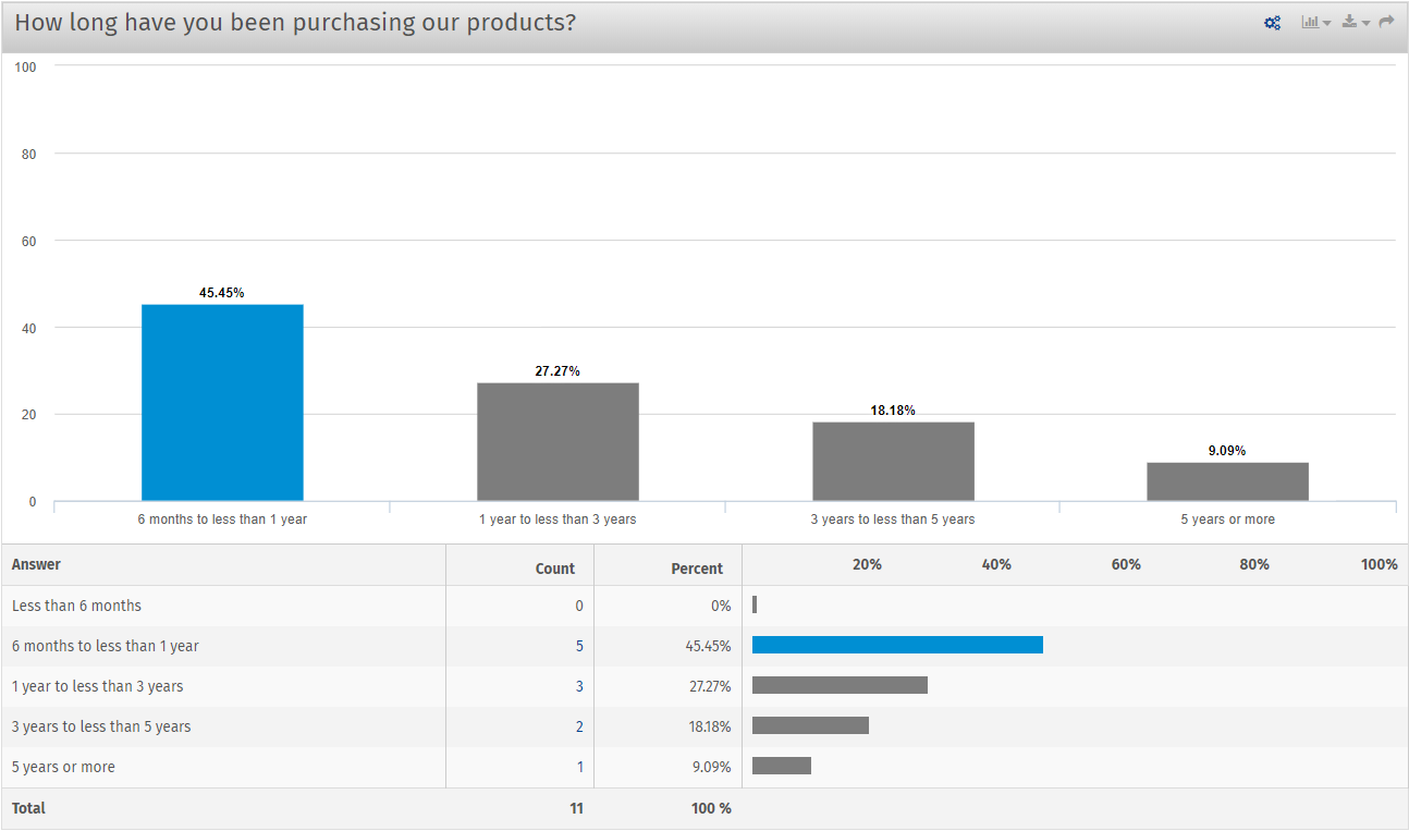
Column Chart:
Once the offline data is synced with your QuestionPro account, you can view it in column charts. It is a vertical bar type of chart that presents a numerical comparison between the different answer options of an open-ended survey question.
The column chart under the data visualization tool makes the data insightful and presentable by taking advantage of the height of the column, which, in reality, reflects the difference in data. As the human eye is sensitive to the height difference understanding the data insights using a column chart becomes easier for the decision-makers.
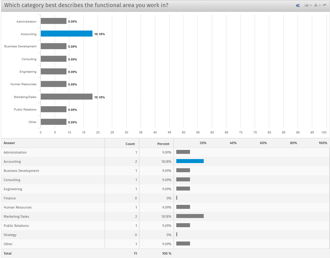
Bar Charts:
In many ways, bar charts and similar to the column charts. The significant difference in them is the number of bars can be relatively high compares to columns. Additionally, the position of its two axes is also changed.
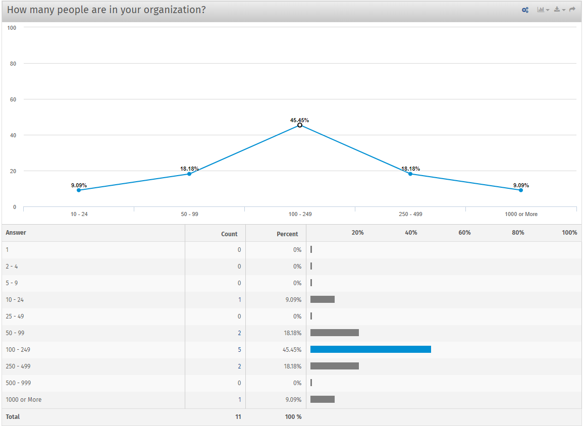
Line Chart:
The data visualization tool allows you to present the data in the line chart. It is the preferred chart type used by researchers when they want to showcase the change of data over a continuous time interval. The line chart usually refects the change in survey data over data over some time.
The data visualization tool ensures that the number of data records in the line chart is never more than two making it usable for trend comparison, especially of a large volume of data.
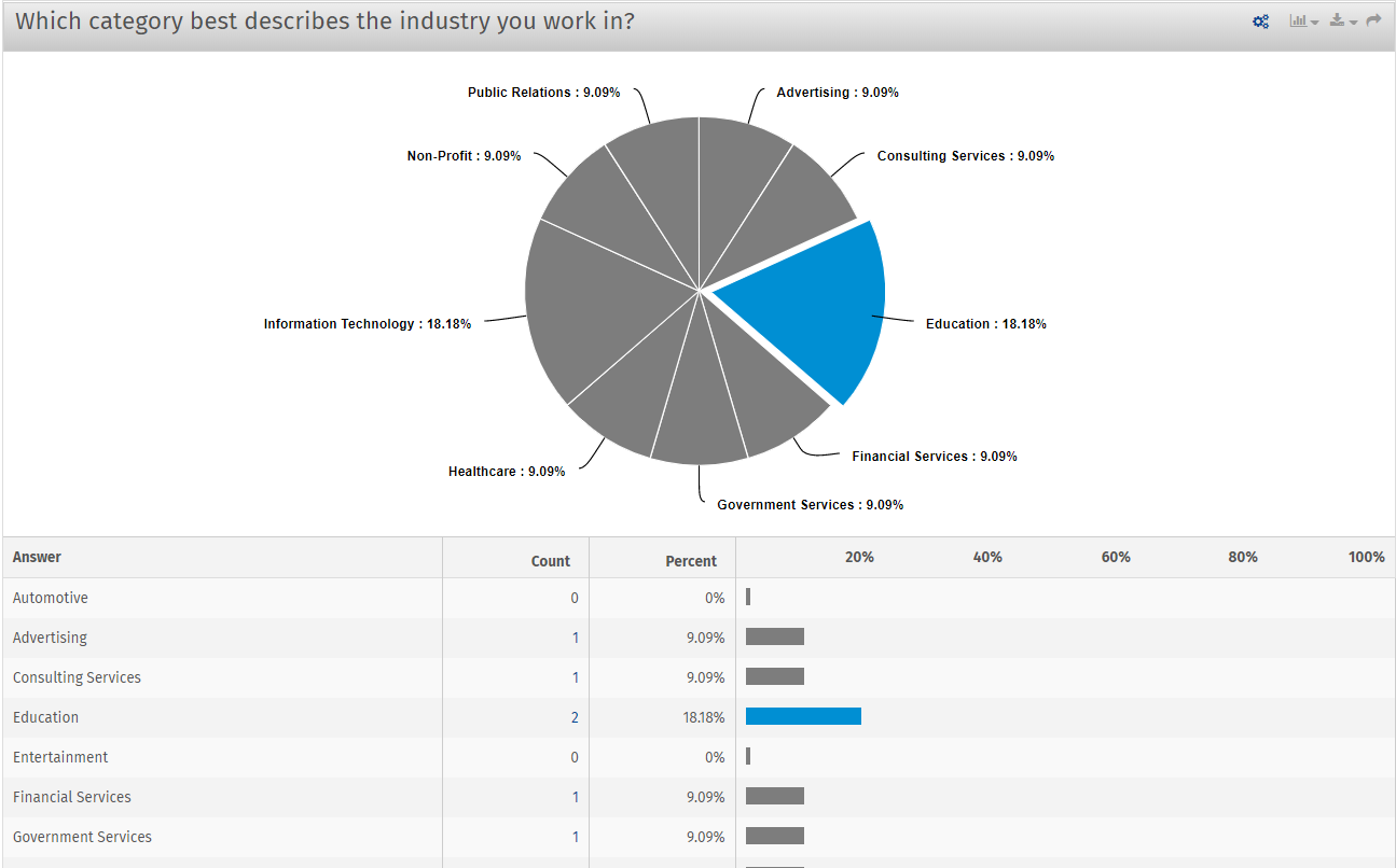
Pie chart:
Pie charts are used by default in Questionpro to represent the raw survey data. Pie charts are more comfortable to represent a proportion of different classification as well as compare various classification by the arc.
QuestionPro recommends not to use pie charts for data visualization of multiple series of data. Because with the increase in series, each slice in the pie chart becomes smaller, making it difficult to distinguish the slides.
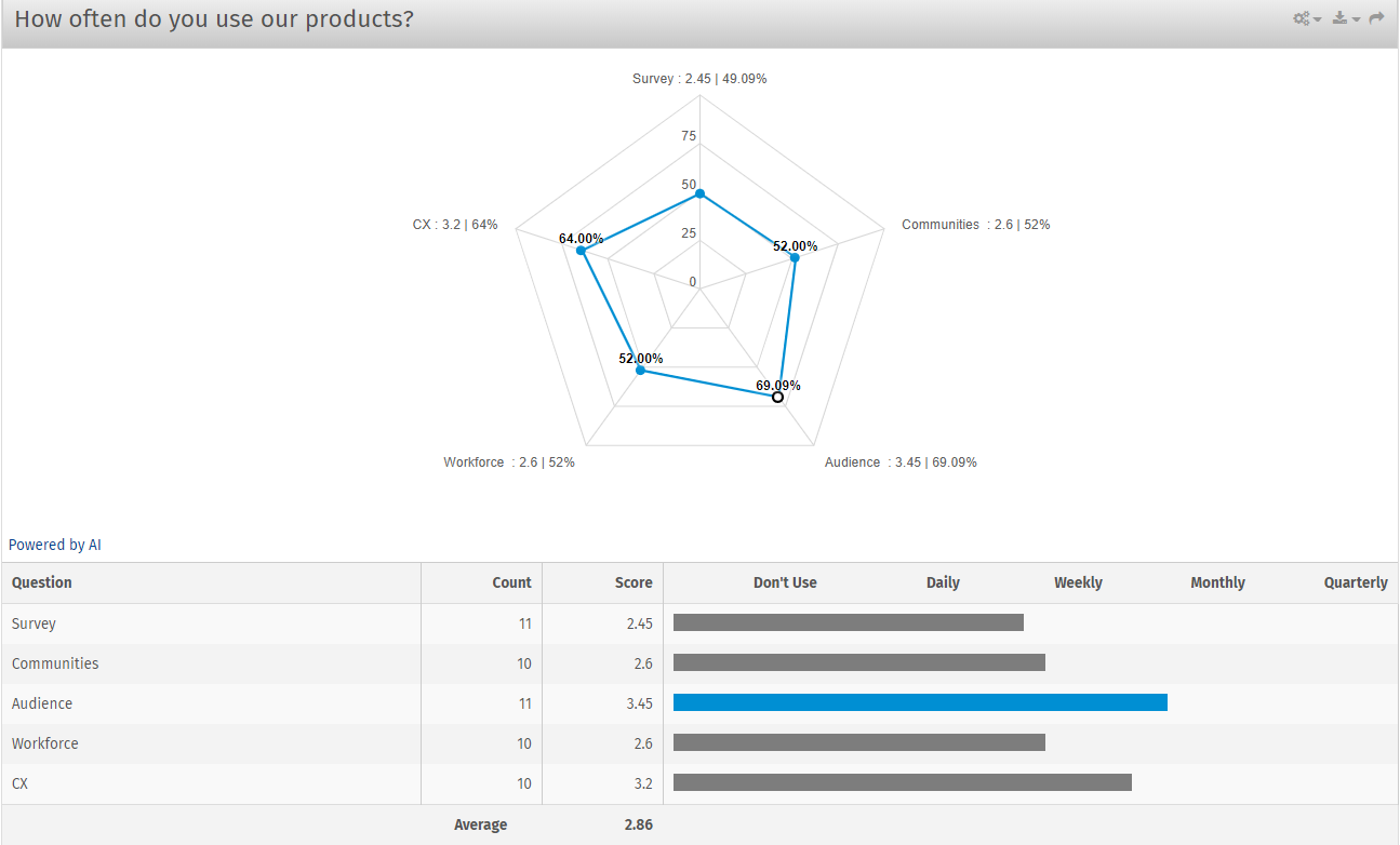
Spider Chart:
Whenever you have a matrix question in your surveys, you can use spider charts to present the data. Spider charts compare multiple quantized variables; as if, variables having similar values or extreme values. With the use of a spider chart, decision-makers can analyze the set of variables having higher and lower values. Use spider charts in the data visualization tool to demonstrate the data gathered through the matrix question type.
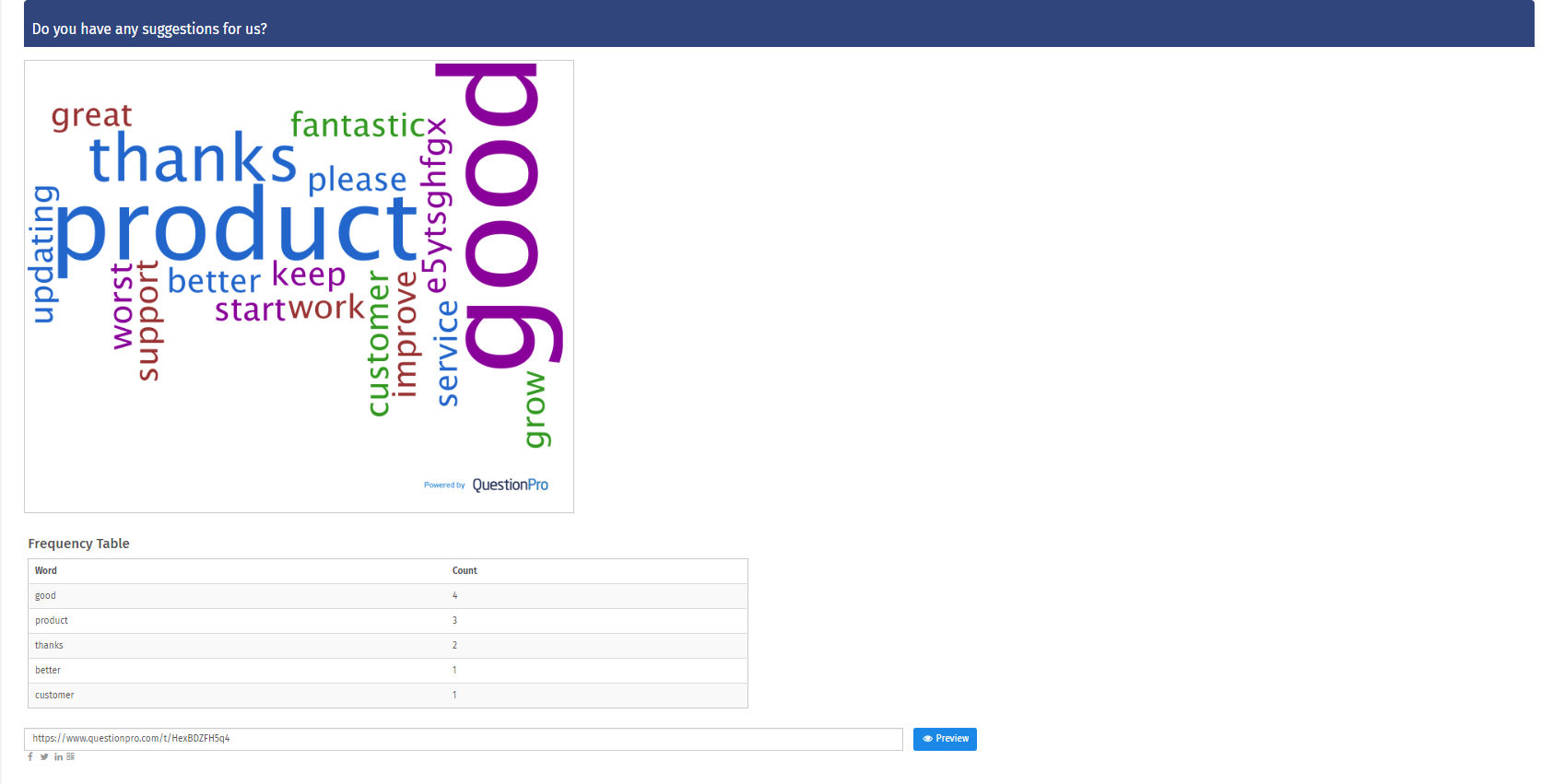
Word cloud chart:
The word cloud represents the collected survey data in a visually appealing manner. It is like a graphic presentation of vocabulary in a color cloud. It is used to demonstrate the enormous pile of text data collected through open-ended questions so that the decision-makers can understand the most prominent and widely used words by the respondents.
Create a Free Survey
 Survey Software
Easy to use and accessible for everyone. Design, send and analyze online surveys.
Survey Software
Easy to use and accessible for everyone. Design, send and analyze online surveys.
 Research Suite
A suite of enterprise-grade research tools for market research professionals.
Research Suite
A suite of enterprise-grade research tools for market research professionals.
 Customer Experience
Experiences change the world. Deliver the best with our CX management software.
Customer Experience
Experiences change the world. Deliver the best with our CX management software.
 Employee Experience
Create the best employee experience and act on real-time data from end to end.
Employee Experience
Create the best employee experience and act on real-time data from end to end.