It’s not what you say — it’s how you say it. And when it comes to communicating your survey results quickly and effectively you don’t have to go far inside of QuestionPro to find some mad reporting tools.
Having been a QuestionPro customer since the beginning, I can honestly say that their reporting features continue to beat the pack in all the ways that are important to me as a marketing and product manager and consultant. I have a cadre of clients for whom I’m running a variety of projects. Each client has their own brand, each client wants to see reports a “certain way” and each client wants to get frequent updates on their projects.
To meet everyone’s needs, I’d either have to spend 20 hours a week doing nothing but formatting reports or I’d have to hire an expensive admit to do these things for me. Neither of these sounds very appealing and this is a HUGE reason why I’m such a fan of QuestionPro’s reporting tools.
The more I talk to other QuestionPro users, the more I learn that many of us are way to busy to uncover which of the many features are most useful to us — so today, I’m going to tell you about three very cool ways to give your clients the reports they want to see – the way they want to see them. I promise you — these are enterprise level features on a small business budget.
1. Custom Branded Reports
The first thing you’ll want to do when the results to your survey come pouring in is create a custom branded online report.
To do this:
Login / Surveys / Reports / Real Time Summary/ Theme
You’ll notice that you can change the entire THEME of the report. That means customizing color to match your desired brand and font. Now if your client has crazy fonts — you will have to choose something that’s close enough and still looks good.
You will have a couple of ways to customize the color. You can either use the HTML color codes — if you’re not sure what they are, you can try this ColorPicker tool, or you can use the provided HTML code color picker. Both are super easy.
2. Customize Charts and Data
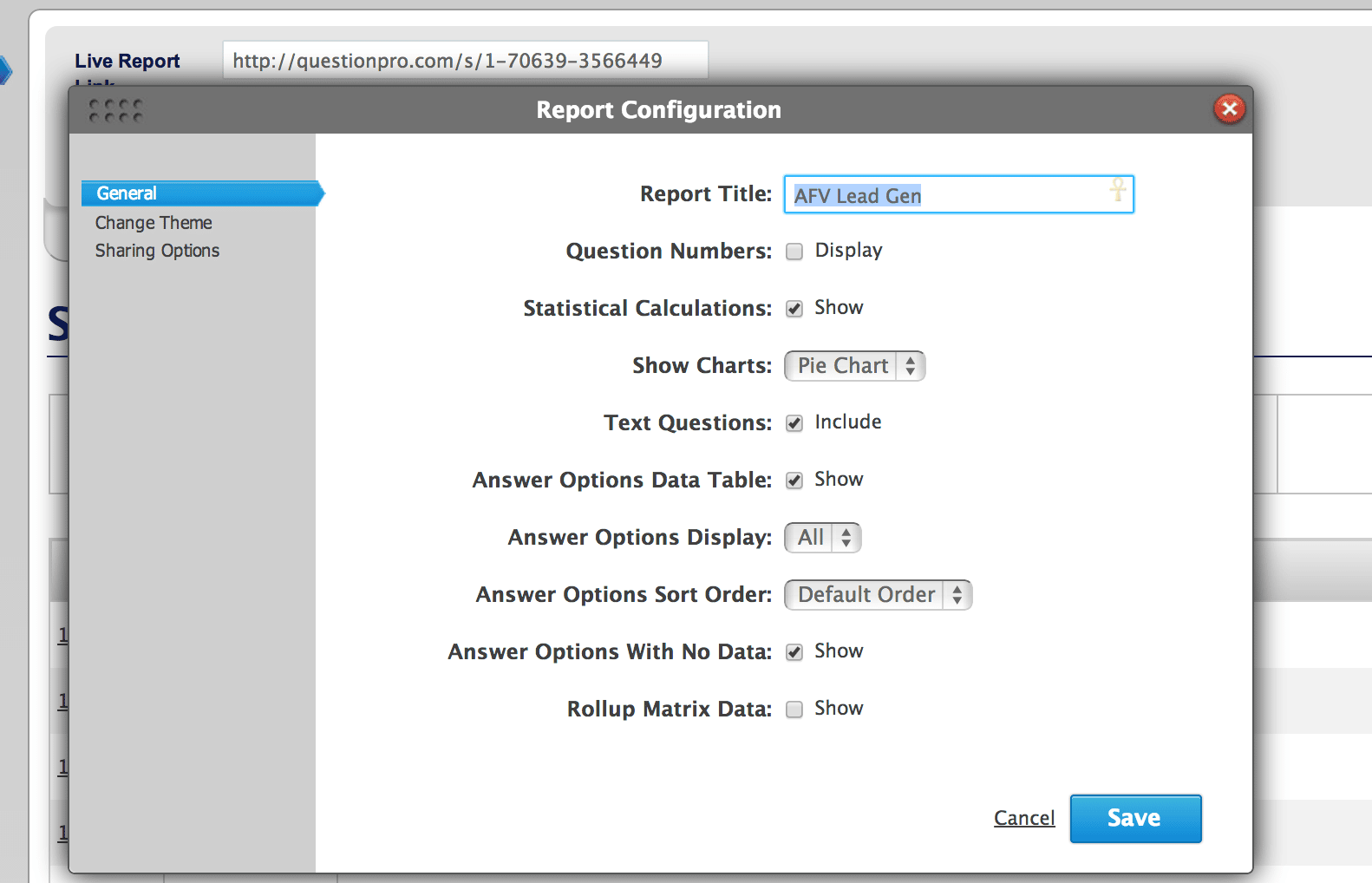
Another often forgotten or overlooked option is to customize the charts and data reporting. So you don’t have to live with a boring bar chart — you can either have no chart (no fun) or a pie chart! I love that option because so much of the data is presented as a percentage — and pie charts are so much better for that.
To do this;
Login / Surveys / Reports / Real Time Summary/ General
3. Download images and customize
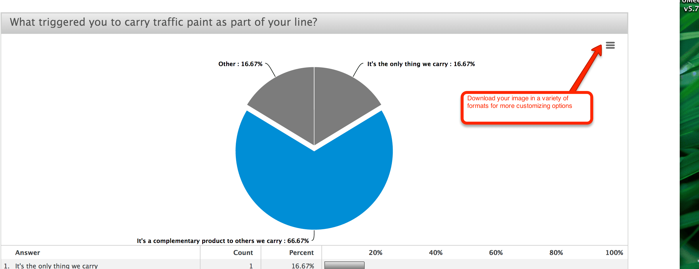
Another very cool way to customize your reports is the ability to download the pie or bar charts from the online report to include in a written report:

Inside of your real-time summary report – when you get to a chart — look in the upper right hand corner and you’ll see a small box – click on that and you’ll get all the different download options; JPEG, PNG, PDF and vector.
What’s been your experience with the reporting tool? You can leave a comment below OR — you can join us on our weekly Google Hangout called “Features and Faves” .


[…] or weekly summaries, just click on this link and send it on over. They will be able to see charts AND open-ended text. Gotta love […]