• Skip to main content
  • Skip to primary sidebar
  • Skip to footer
QuestionPro

QuestionPro

questionpro logo
  • Products
    survey software iconSurvey softwareEasy to use and accessible for everyone. Design, send and analyze online surveys.research edition iconResearch SuiteA suite of enterprise-grade research tools for market research professionals.CX iconCustomer ExperienceExperiences change the world. Deliver the best with our CX management software.WF iconEmployee ExperienceCreate the best employee experience and act on real-time data from end to end.
  • Solutions
    IndustriesGamingAutomotiveSports and eventsEducationGovernment
    Travel & HospitalityFinancial ServicesHealthcareCannabisTechnology
    Use CaseAskWhyCommunitiesAudienceContactless surveysMobile
    LivePollsMember ExperienceGDPRPositive People Science360 Feedback Surveys
  • Resources
    BlogeBooksSurvey TemplatesCase StudiesTrainingHelp center
  • Features
  • Pricing
Language
  • English
  • Español (Spanish)
  • Português (Portuguese (Brazil))
  • Nederlands (Dutch)
  • العربية (Arabic)
  • Français (French)
  • Italiano (Italian)
  • 日本語 (Japanese)
  • Türkçe (Turkish)
  • Svenska (Swedish)
  • Hebrew IL (Hebrew)
  • ไทย (Thai)
  • Deutsch (German)
  • Portuguese de Portugal (Portuguese (Portugal))
Call Us
+1 800 531 0228 +1 (647) 956-1242 +52 999 402 4079 +49 301 663 5782 +44 20 3650 3166 +81-3-6869-1954 +61 2 8074 5080 +971 529 852 540
Log In Log In
SIGN UP FREE

Home Market Research

Marimekko Chart: What It Is + Interpretation with Examples

Marimekko Chart

The Marimekko chart is highly useful for companies because it provides a better view of data in a visually intuitive format, which allow businesses to analyze and communicate complex relationships. Let’s review why this chart is so valuable.

What Is a Marimekko Chart?

A Marimekko chart can also be known as a mekko chart and it is a type of bar chart where the width of each bar represents one dimension of data, like a category’s size, while the height of each segment in a bar represents the proportions of subcategories within that category.

It’s used to show absolute values through width and percentages through height in one chart.

The Marimekko chart gets its name from the Finnish textile and fashion company Marimekko, which is known for its bold, colorful, and geometric patterns. The chart resembles the designs created by the company, with its stacked and proportionally sized segments resembling Marimekko’s signature block-style motifs.

The name has become a widely recognized way to refer to this type of proportional and stacked bar chart, emphasizing its visual appeal and ability to communicate multiple dimensions of data in an effective way.

Marimekko Chart Example: Smartphone Market

To understand the marimekko chart in action, let’s analyze the global smartphone market in a simple way. Let’s start by comparing market share by brand. We will use Apple, Samsung, and Xiaomi as examples, and within each brand, how sales are distributed across price tiers (budget, mid-range, premium).

Here’s how the data might look:

BrandMarket Share (%)Budget (%)Mid-range (%)Premium (%)
Apple40%0%20%80%
Samsung35%25%50%25%
Xiaomi25%70%25%5%

And this is what the data could look like in a Marimekko chart.

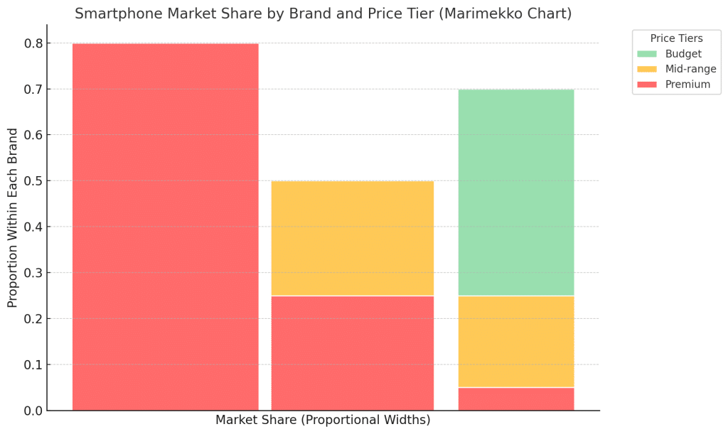
In this case, the Marimekko chart ideal for showing both market dominance and subcategory contributions.

Width tells us absolute market size: Apple has the largest share (40%), followed by Samsung (35%) and Xiaomi (25%).
Height within each bar tells us proportions: For example, almost all of Apple’s sales come from premium phones, while Xiaomi dominates the budget segment.

Importance of Marimekko Chart

The Marimekko chart shows two pieces of information at the same time: the width of the bars represents one data point, and the height of the segments within the bars shows another data point. This lets you see both the big picture and the details that makes up each category all in one chart.

Market segmentation with a Marimekko chart allows companies to see how their market is divided across different categories and subcategories. For example, a company could use the chart to compare the performance of various brands in different regions or customer demographic data.

The width of each bar would show the overall size of the segment like total sales in each region, while the height of the segments within the bar would represent the breakdown of subcategories like product types or customer age groups. This helps businesses identify which segments are performing well, where their strengths lie, and areas where they might have opportunities to grow.

How to Interpret Marimekko Charts

Marimekko charts are great for visualizing data with two dimensions. When used correctly, we can gather insights into overall category sizes and subcategory contributions. Here’s how to interpret them effectively:

  1. The width of each bar in a Marimekko chart should represents the proportional value of a category relative to the total. For example, in a chart analyzing market share, the width of a bar shows how much of the market a specific brand owns. A wider bar indicates a larger share, making it easy to see which categories dominate the data set.
  2. The height of each segment within a bar reflects the proportion of subcategories within that category. For instance, a segment might show how a brand’s sales are divided across price tiers like budget, mid-range, and premium, as we learn in the example before. Taller segments highlight a more significant contribution from a specific subcategory, giving us a deeper understanding of what drives the category’s total value.
  3. To analyze the chart, compare the widths of the bars to identify overall dominance and the heights of the segments to understand the composition within each category. For example, a wide bar with one tall segment might indicate that a brand dominates the market through one strong subcategory, while a narrower bar with evenly distributed segments suggests more balanced contributions across subcategories.
  4. Look for patterns or imbalances in the chart. Consistently tall segments across multiple bars could indicate a trend, while a single dominating segment might reveal dependency on one subcategory. These insights can help identify strengths, weaknesses, and opportunities for growth within the data.

Comparing dimensions allow us to identify trends, imbalances, and areas for strategic focus, which makes this chart an excellent option for comprehensive data analysis.

Conclusion

Marimekko charts complement other features such as cross-tabulation, pivot tables, and predictive analytics. They’re particularly useful for resource allocation, strategic decision-making, and stakeholder presentations, as they simplify the communication of complex insights.

It can help visualizing market segmentation, campaign performance, and employee diversity data, for example. Marimekko charts can provide clarity and depth of data analysis.

Remember you can always turn complex, multi-dimensional data into clear and actionable insights. QuestionPro makes it easy to create visually compelling Marimekko charts that drive smarter decisions.

Start exploring advanced analytics today and find what better fit your needs—Request a free demo and see how QuestionPro can transform the way you visualize and act on your data!

Create memorable experiences based on real-time data, insights and advanced analysis. Request Demo

SHARE THIS ARTICLE:

About the author
QuestionPro Collaborators
Worldwide team of Content Creation specialists focusing on Research, CX, Workforce, Audience and Education.
View all posts by QuestionPro Collaborators

Primary Sidebar

Research what's on your mind. Find out what's on theirs!

A suite of tools to leverage research and transform insights.

Discover our insight platform

RELATED ARTICLES

HubSpot - QuestionPro Integration

Complaint Resolution: What it is & How to Handle It

Sep 26,2022

HubSpot - QuestionPro Integration

Brand Detractor: Detection, Impact + Recovery Strategies

Nov 07,2023

HubSpot - QuestionPro Integration

Repeat Purchase: What it is + How to Promote It in Business?

Aug 25,2023

BROWSE BY CATEGORY

  • Academic
  • Academic Research
  • Artificial Intelligence
  • Assessments
  • Audience
  • Brand Awareness
  • Business
  • Case Studies
  • Communities
  • Consumer Insights
  • Customer effort score
  • Customer Engagement
  • Customer Experience
  • Customer Loyalty
  • Customer Research
  • Customer Satisfaction
  • CX
  • Employee Benefits
  • Employee Engagement
  • Employee Engagement
  • Employee Retention
  • Enterprise
  • Events
  • Forms
  • Friday Five
  • General Data Protection Regulation
  • Guest Post
  • Insights Hub
  • Life@QuestionPro
  • LivePolls
  • Market Research
  • Marketing
  • Mobile
  • Mobile App
  • Mobile diaries
  • Mobile Surveys
  • New Features
  • non-profit
  • NPS
  • Online Communities
  • Polls
  • Question Types
  • Questionnaire
  • QuestionPro
  • QuestionPro Products
  • Release Notes
  • Research Tools and Apps
  • Revenue at Risk
  • Startups
  • Survey Templates
  • Surveys
  • Tech News
  • Tips
  • Training
  • Training Tips
  • Trending
  • Tuesday CX Thoughts (TCXT)
  • Uncategorized
  • VOC
  • Webinar
  • Webinars
  • What’s Coming Up
  • Workforce
  • Workforce Intelligence

Footer

MORE LIKE THIS

Medtech Market Research

MedTech Market Research: Fueling Innovation in 2025

May 8, 2025

customer-retention-strategies

15 Top Customer Retention Strategies to Boost Loyalty in 2025

May 8, 2025

the-home-depot-nps-2025

The Home Depot NPS & Customer Satisfaction 2025

May 7, 2025

panel-research-companies

Top 8 Panel Research Companies for Quality Research in 2025

May 6, 2025

Other categories

  • Academic
  • Academic Research
  • Artificial Intelligence
  • Assessments
  • Audience
  • Brand Awareness
  • Business
  • Case Studies
  • Communities
  • Consumer Insights
  • Customer effort score
  • Customer Engagement
  • Customer Experience
  • Customer Loyalty
  • Customer Research
  • Customer Satisfaction
  • CX
  • Employee Benefits
  • Employee Engagement
  • Employee Engagement
  • Employee Retention
  • Enterprise
  • Events
  • Forms
  • Friday Five
  • General Data Protection Regulation
  • Guest Post
  • Insights Hub
  • Life@QuestionPro
  • LivePolls
  • Market Research
  • Marketing
  • Mobile
  • Mobile App
  • Mobile diaries
  • Mobile Surveys
  • New Features
  • non-profit
  • NPS
  • Online Communities
  • Polls
  • Question Types
  • Questionnaire
  • QuestionPro
  • QuestionPro Products
  • Release Notes
  • Research Tools and Apps
  • Revenue at Risk
  • Startups
  • Survey Templates
  • Surveys
  • Tech News
  • Tips
  • Training
  • Training Tips
  • Trending
  • Tuesday CX Thoughts (TCXT)
  • Uncategorized
  • VOC
  • Webinar
  • Webinars
  • What’s Coming Up
  • Workforce
  • Workforce Intelligence

questionpro-logo-nw
Help center Live Chat SIGN UP FREE
  • Sample questions
  • Sample reports
  • Survey logic
  • Branding
  • Integrations
  • Professional services
  • Security
  • Survey Software
  • Customer Experience
  • Workforce
  • Communities
  • Audience
  • Polls Explore the QuestionPro Poll Software - The World's leading Online Poll Maker & Creator. Create online polls, distribute them using email and multiple other options and start analyzing poll results.
  • Research Edition
  • LivePolls
  • InsightsHub
  • Blog
  • Articles
  • eBooks
  • Survey Templates
  • Case Studies
  • Training
  • Webinars
  • All Plans
  • Nonprofit
  • Academic
  • Qualtrics Alternative Explore the list of features that QuestionPro has compared to Qualtrics and learn how you can get more, for less.
  • SurveyMonkey Alternative
  • VisionCritical Alternative
  • Medallia Alternative
  • Likert Scale Complete Likert Scale Questions, Examples and Surveys for 5, 7 and 9 point scales. Learn everything about Likert Scale with corresponding example for each question and survey demonstrations.
  • Conjoint Analysis
  • Net Promoter Score (NPS) Learn everything about Net Promoter Score (NPS) and the Net Promoter Question. Get a clear view on the universal Net Promoter Score Formula, how to undertake Net Promoter Score Calculation followed by a simple Net Promoter Score Example.
  • Offline Surveys
  • Customer Satisfaction Surveys
  • Employee Survey Software Employee survey software & tool to create, send and analyze employee surveys. Get real-time analysis for employee satisfaction, engagement, work culture and map your employee experience from onboarding to exit!
  • Market Research Survey Software Real-time, automated and advanced market research survey software & tool to create surveys, collect data and analyze results for actionable market insights.
  • GDPR & EU Compliance
  • Employee Experience
  • Customer Journey
  • Synthetic Data
  • About us
  • Executive Team
  • In the news
  • Testimonials
  • Advisory Board
  • Careers
  • Brand
  • Media Kit
  • Contact Us

QuestionPro in your language

  • English
  • Español (Spanish)
  • Português (Portuguese (Brazil))
  • Nederlands (Dutch)
  • العربية (Arabic)
  • Français (French)
  • Italiano (Italian)
  • 日本語 (Japanese)
  • Türkçe (Turkish)
  • Svenska (Swedish)
  • Hebrew IL (Hebrew)
  • ไทย (Thai)
  • Deutsch (German)
  • Portuguese de Portugal (Portuguese (Portugal))

Awards & certificates

  • survey-leader-asia-leader-2023
  • survey-leader-asiapacific-leader-2023
  • survey-leader-enterprise-leader-2023
  • survey-leader-europe-leader-2023
  • survey-leader-latinamerica-leader-2023
  • survey-leader-leader-2023
  • survey-leader-middleeast-leader-2023
  • survey-leader-mid-market-leader-2023
  • survey-leader-small-business-leader-2023
  • survey-leader-unitedkingdom-leader-2023
  • survey-momentumleader-leader-2023
  • bbb-acredited
The Experience Journal

Find innovative ideas about Experience Management from the experts

  • © 2022 QuestionPro Survey Software | +1 (800) 531 0228
  • Sitemap
  • Privacy Statement
  • Terms of Use