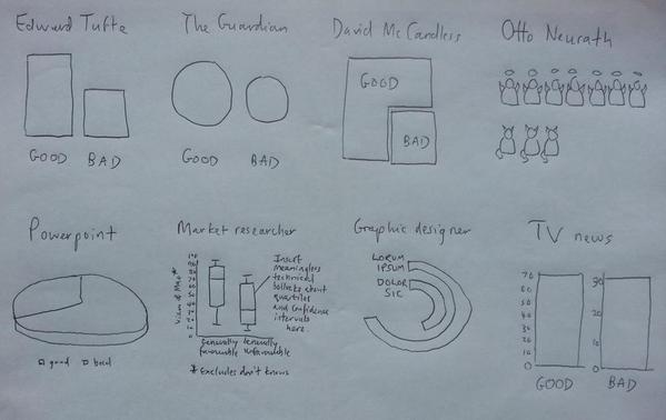

Each chart represents one simple piece of data. Any guesses what that data might be?
Data visualization: don’t overcomplicate
Here is what each chart was portraying: “Mao was ‘70% good, 30% bad’ according to the Chinese government.”
It seems that in every profession, we can get mired in a certain way of doing things, including visualizing data. And the type of visualization can either make sense, confuse, or even seemingly distort the data being presented.
In this era of focusing on data visualization, I’d like to issue a word of caution. Yes, we’ve heard that pie charts are overused. However, it doesn’t mean that we always need to find a super-fancy-schmancy way to represent simple pieces of data. We can go too far in trying to find an interesting, eye-catching, novel way to represent data that we end up losing focus on being able to actually tell the right story with the appropriate supporting visuals.
Quick tips to choose the right visual
As with everything else, choosing the right visual to represent your data may depend on your audience. One audience might respond well to a pie chart showing how much time each department is using from a vendor; another audience might get stuck on that pie chart and end up arguing about who is using too much time versus who is using too little time, leading to a need to represent the data with a different chart to bring the focus back on how many requests are coming in from each department (true story).
It should also depend on the data being represented. Are you trying to show increases in satisfaction? Perhaps a simple line chart of satisfaction trended over time would do. Are you trying to show hours spent on a particular project? Perhaps a stacked bar chart would be better, especially if you want to highlight where the most hours went for the project.
Which brings me to the third dependency: the story you want to tell with the chart. And this is where data visualization can end up trying too hard to tell the story in a way that will capture the viewers’ attention. Just remember that, often, simpler is better.
Because, after all, sometimes, a simple bar chart is really all you need.


