Survey response rates play a pivotal role in the success of any study in market research. Researchers are consistently exploring innovative strategies to engage participants and elicit meaningful responses.
Many brands that use QuestionPro are always looking for ways to collect survey responses faster and better with a reduced survey dropout rate and increased survey data quality.
One effective approach gaining prominence is leveraging a visual layout within surveys to create a more engaging and user-friendly experience.
What is a Visual Layout?
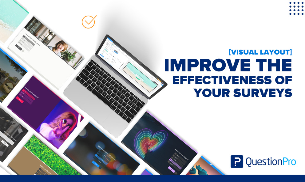
Visual layout integrates design-driven feedback principles, facilitating the creation of visually appealing surveys that captivate respondents at every step. Users have the flexibility to customize background images for each question, adding a personal touch to their survey experience.
Visual layout, developed by QuestionPro, enhances survey design to engage respondents dynamically and respond to their feedback in real time.
Studies show up to a 50% increase in response rates when surveys are visually branded.
With its flexible design options, including individual question placement and appearance, the visual layout ensures surveys resonate effectively with respondents, regardless of their device.
Enjoy complete control over question placement and appearance on the screen without worrying about compatibility across devices. Visual layout seamlessly maintains its display consistency across various devices, including laptops, tablets, mobiles, and TVs, providing a user-friendly feedback experience for respondents.
Five Advantages for Brands to use Visual Layout in Surveys
There are five distinct advantages and ways brands use the QuestionPro Visual Layout to increase the effectiveness of survey research.
- Capturing audience attention
Visual elements, such as vibrant colors, images, and well-designed layouts, can immediately capture participants’ attention. When a survey mirrors a brand’s visuals, it elicits a much higher brand recall.
As users are becoming tired of being bombarded with information, a visually appealing survey that mirrors a known brand is more likely to stand out and attract respondents. By making the survey visually enticing, researchers set the stage for increased participant engagement.
- User-friendly interface
A visually optimized survey enhances the overall user experience. A clean and organized layout contributes to the ease of navigation, reducing respondents’ likelihood of prematurely abandoning the survey. Clear instructions, concise questions, and logical progression through the survey create a user-friendly interface, promoting a positive interaction between participants and the research instrument.
- Mobile responsiveness
Given the prevalence of mobile devices, ensuring that surveys are visually appealing and functional on various screen sizes is imperative. A responsive visual layout adapts to different devices, providing a seamless experience for participants regardless of whether they are accessing the survey on a desktop, tablet, or smartphone. This adaptability contributes significantly to increased response rates, especially among users who prefer mobile devices.
- Enhancing comprehension
Visual aids, such as charts, graphs, and other illustrative elements, can enhance participants’ understanding of complex concepts: recognizable colors and visuals better aid respondents in resonating with a brand. Visual representations of data make information more digestible, leading to more accurate responses. Researchers can leverage visuals to communicate ideas effectively, reducing the cognitive load on respondents and increasing the likelihood of thoughtful and accurate answers.
- Building trust and professionalism
A well-designed survey conveys professionalism and fosters trust. Participants are more likely to engage with a legitimate, credible, and professionally crafted survey. A visually polished survey reflects positively on the research study and the organization conducting it, encouraging respondents to invest time and effort in providing thoughtful responses. With the use of the visual layout, respondents are likelier to complete surveys that they start, increasing research efficacy.
Brands, researchers, and organizations alike are using visual layouts to:
- Increase survey response rates
- Reduce survey dropout rates
- Co-create with customers and promoters
- Elicit brand emotions
- Increase brand recall
To use visual layout in your surveys and research studies, read our help file on how to set up visual layout.
Get started with QuestionPro visual layout today
Incorporating a visual layout into market research surveys is a strategic approach to not only attract respondents but also to enhance the overall quality of data collected. From capturing attention to creating a user-friendly interface, visual elements contribute significantly to increasing survey response rates. As the landscape of market research continues to evolve, embracing innovative techniques, such as visual optimization, becomes essential for researchers aiming to maximize participant engagement and glean valuable insights.


