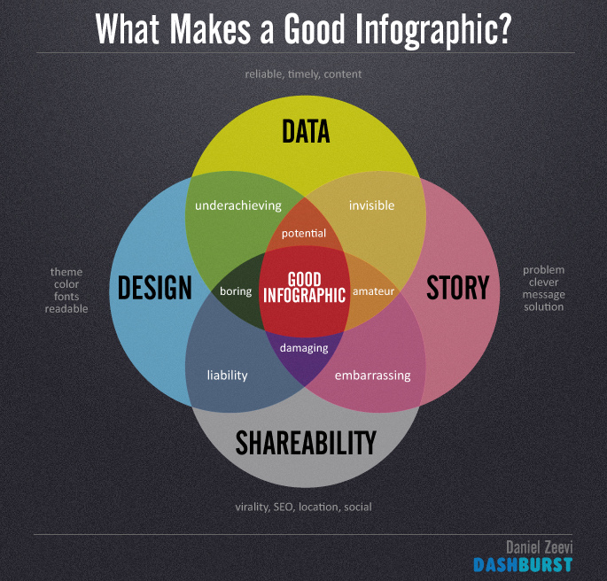
Infographics: right now, they are all the rage, and for good reason. Instead of asking you to read a report, infographics take the same bullet points and make them pop so that they’re visually appealing. With the visual in hand, let’s now craft the story.
What an infographic is…and isn’t
Before we create the story from the infographic, let’s review what we can expect (and what we shouldn’t expect) from an infographic.
An infographic is…
- Visually appealing. Which would you rather see, bullet points of data, or graphical representations of data?
- Data. At the end of the day, infographics are still just charts of data. Yes, they’re pretty charts, but they’re still charts of data.
- Quantitative. The best use of an infographic is to present quantitative information. (see previous bullet point)
An infographic is not…
- A story. Data does not a story make.
- Qualitative. Some quotes can be thrown into an infographic, but they’re mainly there to support the quantitative data being presented. Infographics can present qualitative data well, but I’d argue it’s done in a quantitative format (word clouds are still basically frequency charts).
Crafting a story from an infographic
Take this example from Wayne Breitbarth’s 2015 Profile of a LinkedIn User. Using this infographic, let’s write a story of an average LinkedIn user. Please note, this is just one possible story that can be crafted using this information.
Jane Doe has around 500 people in her LinkedIn network, but she really isn’t using the full power that LinkedIn provides, and seems to be unconvinced about the benefits of a premium account since she’s still using the free account. She’s using Facebook and Twitter as the other social media platforms with which to build her business, which might explain why she mostly just shares status updates on her company page instead of using some of the other LinkedIn features like building showcase pages for her company. It could also explain why she hasn’t added any type of media to her LinkedIn profile and why she doesn’t really use LinkedIn to connect with people she doesn’t know (which sounds a bit like an extension of the warnings against doing that on Facebook). Instead, she uses LinkedIn to reconnect with former coworkers more than she uses it to connect with new customers or potential business partners. After all, LinkedIn makes it easy to reconnect with the “People You May Know” feature. She also loves that “Who’s Reviewed Your Profile” feature, though she probably isn’t quite sure what to do with it beyond finding it intriguing (and, at times, unsurprising, especially if she had meetings with some of the people who show up on that list).
I made some inferences based on the data given in the infographic, but I think the inferences made are pretty reasonable and not too much of a stretch. Using this, we have a few takeaways that may not have been as apparent from the infographic alone. As LinkedIn, I need to acknowledge the influence of other social media platforms on my user base, including their effect on how a user will approach my own platform. How do I, as LinkedIn, show the benefits of using some of the features that differentiate my platform from others, such as the premium LinkedIn subscription? And how can I address the privacy and safety concerns that my user base likely has as a result of the warnings given about how to use Facebook, to encourage them to make industry connections with people they haven’t met in person?
The takeaways from the story don’t just apply to LinkedIn, though. As a company on LinkedIn, if I want to stand out, I can use some of the features that are going largely untapped, such as the showcase pages. As a LinkedIn user, I can also use this information to learn how to stand out, such as adding media to my own profile, since so few have done that so far.
Final thoughts
Crafting stories from data can be so much more compelling than even the best infographic. While infographics are orders of magnitude easier to digest than bullet points of data, taking that next step to pull a story from the information can help your audience see the connections in the data. And from those connections, we can then help them more easily understand the potential actions to be taken after reviewing the data.


