Understanding Data
We’ve been having a rather intense conversations around decisions and data lately- so imagine my happy surprise when I received this guest article from Nathan Yau, author of Data Points: Visualization That Means Something. I was thrilled because this article shows the power that context brings to data.
As you read this, consider how you can use the QuestionPro App to bring patterns and context to light for your own survey data!
By Nathan Yau,
Author of Data Points: Visualization That Means Something
Look up at the night sky, and the stars look like dots on a flat surface. The lack of visual depth makes the translation from sky to paper fairly straightforward, which makes it easier to imagine constellations. Just connect the dots. However, although you perceive stars to be the same distance away from you, they are actually varying light years away.
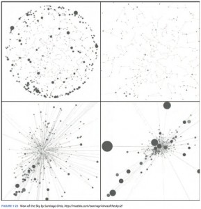
If you could fly out beyond the stars, what would the constellations look like? This is what Santiago Ortiz wondered as he visualized stars from a different perspective, as shown in Figure 1-25.
The initial view places the stars in a global layout, the way you see them. You look at Earth beyond the stars, but as if they were an equal distance away from the planet.
Zoom in, and you can see constellations how you would from the ground, bundled in a sleeping bag in the mountains, staring up at a clear sky.
The perceived view is fun to see, but flip the switch to show actual distance, and it gets interesting. Stars transition, and the easy-to-distinguish constellations are practically unrecognizable. The data looks different from this new angle.
This is what context can do. It can completely change your perspective on a dataset, and it can help you decide what the numbers represent and how to interpret them. After you do know what the data is about, your understanding helps you find the fascinating bits, which leads to worthwhile visualization.
Without context, data is useless, and any visualization you create with it will also be useless. Using data without knowing anything about it, other than the values themselves, is like hearing an abridged quote secondhand and then citing it as a main discussion point in an essay. It might be okay, but you risk finding out later that the speaker meant the opposite of what you thought.
You have to know the who, what, when, where, why, and how — the metadata, or the data about the data — before you can know what the numbers are actually about.
Who: A quote in a major newspaper carries more weight than one from a celebrity gossip site that has a reputation for stretching the truth. Similarly, data from a reputable source typically implies better accuracy than a random online poll.
For example, Gallup, which has measured public opinion since the 1930s, is more reliable than say, someone (for example, me) experimenting with a small, one-off Twitter sample late at night during a short period of time. Whereas the former works to create samples representative of a region, there are unknowns with the latter.
Speaking of which, in addition to who collected the data, who the data is about is also important. Going back to the gumballs, it’s often not financially feasible to collect data about everyone or everything in a population. Most people don’t have time to count and categorize a thousand gumballs, much less a million, so they sample. The key is to sample evenly across the population so that it is representative of the whole. Did the data collectors do that?
How: People often skip methodology because it tends to be complex and for a technical audience, but it’s worth getting to know the gist of how the data of interest was collected.
If you’re the one who collected the data, then you’re good to go, but when you grab a dataset online, provided by someone you’ve never met, how will you know if it’s any good? Do you trust it right away, or do you investigate? You don’t have to know the exact statistical model behind every dataset, but look out for small samples, high margins of error, and unfit assumptions about the subjects, such as indices or rankings that incorporate spotty or unrelated information.
Sometimes people generate indices to measure the quality of life in countries, and a metric like literacy is used as a factor. However, a country might not have up-to-date information on literacy, so the data gatherer simply uses an estimate from a decade earlier. That’s going to cause problems because then the index works only under the assumption that the literacy rate one decade earlier is comparable to the present, which might not be (and probably isn’t) the case.
What: Ultimately, you want to know what your data is about, but before you can do that, you should know what surrounds the numbers. Talk to subject experts, read papers, and study accompanying documentation.
In introduction statistics courses, you typically learn about analysis methods, such as hypothesis testing, regression analysis, and modeling, in a vacuum, because the goal is to learn the math and concepts. But when you get to real-world data, the goal shifts to information gathering. You shift from, “What is in the numbers?” to “What does the data represent in the world; does it make sense; and how does this relate to other data?”
A major mistake is to treat every dataset the same and use the same canned methods and tools. Don’t do that.
When: Most data is linked to time in some way in that it might be a time series, or it’s a snapshot from a specific period. In both cases, you have to know when the data was collected. An estimate made decades ago does not equate to one in the present. This seems obvious, but it’s a common mistake to take old data and pass it off as new because it’s what’s available. Things change, people change, and places change, and so naturally, data changes.
Where: Things can change across cities, states, and countries just as they do over time. For example, it’s best to avoid global generalizations when the data comes from only a few countries. The same logic applies to digital locations. Data from websites, such as Twitter or Facebook, encapsulates the behavior of its users and doesn’t necessarily translate to the physical world.
Although the gap between digital and physical continues to shrink, the space between is still evident. For example, an animated map that represented the “history of the world” based on geotagged Wikipedia, showed popping dots for each entry, in a geographic space. The end of the video is shown in Figure 1-26.
The result is impressive, and there is a correlation to the real-life timeline for sure, but it’s clear that because Wikipedia content is more prominent in English-speaking countries the map shows more in those areas than anywhere else.
Why: Finally, you must know the reason data was collected, mostly as a sanity check for bias. Sometimes data is collected, or even fabricated, to serve an agenda, and you should be wary of these cases. Government and elections might be the first thing that come to mind, but so-called information graphics around the web, filled with keywords and published by sites trying to grab Google juice, have also grown up to be a common culprit. (I fell for these a couple of times in my early days of blogging for FlowingData, but I learned my lesson.)
LEARN ABOUT: Speaker evaluation form
Learn all you can about your data before anything else, and your analysis and visualization will be better for it. You can then pass what you know on to readers.
Figure 1-26
However, just because you have data doesn’t mean you should make a graphic and share it with the world. Context can help you add a dimension — a layer of information — to your data graphics, but sometimes it means it’s better to hold back because it’s the right thing to do.
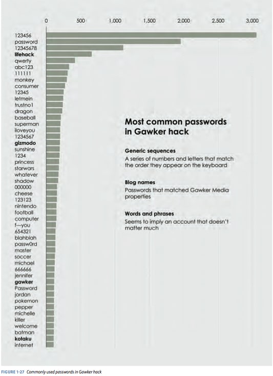
In 2010, Gawker Media, which runs large blogs like Lifehacker and Gizmodo, was hacked, and 1.3 million usernames and passwords were leaked. They were downloadable via BitTorrent. The passwords were encrypted, but the hackers cracked about 188,000 of them, which exposed more than 91,000 unique passwords. What would you do with that kind of data?
The mean thing to do would be to highlight usernames with common (read that poor) passwords, or you could go so far as to create an application that guessed passwords, given a username.
A different route might be to highlight just the common passwords, as shown in Figure 1-27. This offers some insight into the data without making it too easy to log in with someone else’s account. It might also serve as a warning to others to change their passwords to something less obvious. You know, something with at least two symbols, a digit, and a mix of lowercase and uppercase letters. Password rules are ridiculous these days. But I digress.
Figure 1-27
With data like the Gawker set, a deep analysis might be interesting, but it could also do more harm than good. In this case, data privacy is more important, so it’s better to limit what you show and look at.
The leak exposed incidents of abuse and erroneous reporting, such as civilian deaths classified as “enemy killed in action.” On the other hand, it can seem unjustified to publish findings about classified data obtained through less than savory means.
Maybe there should be a golden rule for data: Treat others’ data the way you would want your data treated.
In the end, it comes back to what data represents. Data is an abstraction of real life, and real life can be complicated, but if you gather enough context, you can at least put forth a solid effort to make sense of it.
Excerpted with permission from the publisher, Wiley, from Data Points: Visualization That Means Something by Nathan Yau. Copyright © 2013
Author Bio
Nathan Yau, author of Data Points: Visualization That Means Something, has a PhD in statistics and is a statistical consultant who helps clients make use of their data through visualization. He created the popular site FlowingData.com, and is the author of Visualize This: The FlowingData Guide to Design, Visualization, and Statistics, also published by Wiley.
For more information please visit http://flowingdata.com, and follow the author on Facebook and Twitter






[…] How to Understand Your Data […]