


Pie Chart for your widget
A pie chart is a circular statistical graphic which is divided into slices to illustrate numerical proportion.
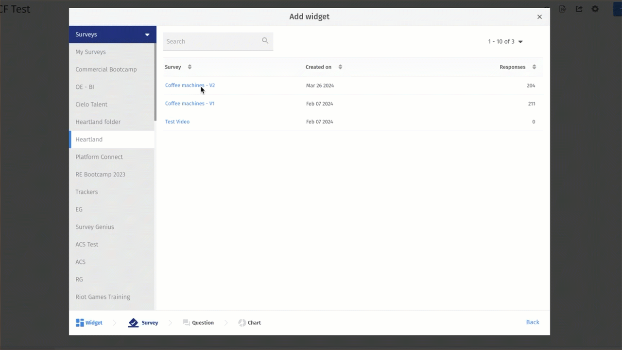
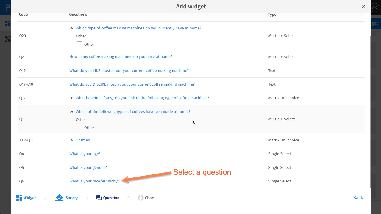
Go to: Login » Select dashboard » Add widget » Question based or continue using this survey » Select question or part of a question » Select the Pie chart type » Add Widget
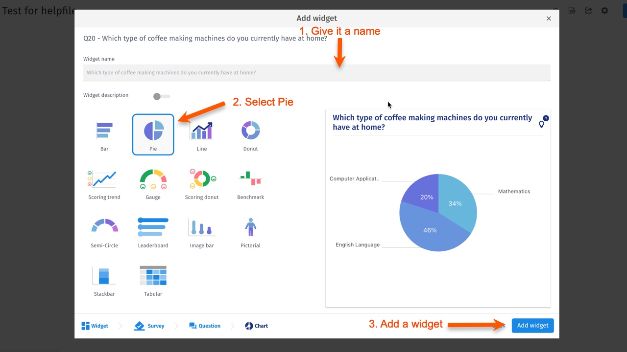
 Step 2: Give a name to widget >> Select Pie Chart type >> Add Widget
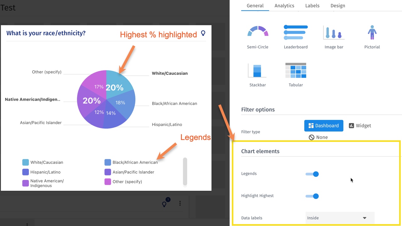
You can customize the chart elements such as enable or disable legends, highlight highest proportion in the chart, display data labels inside or outside the chart
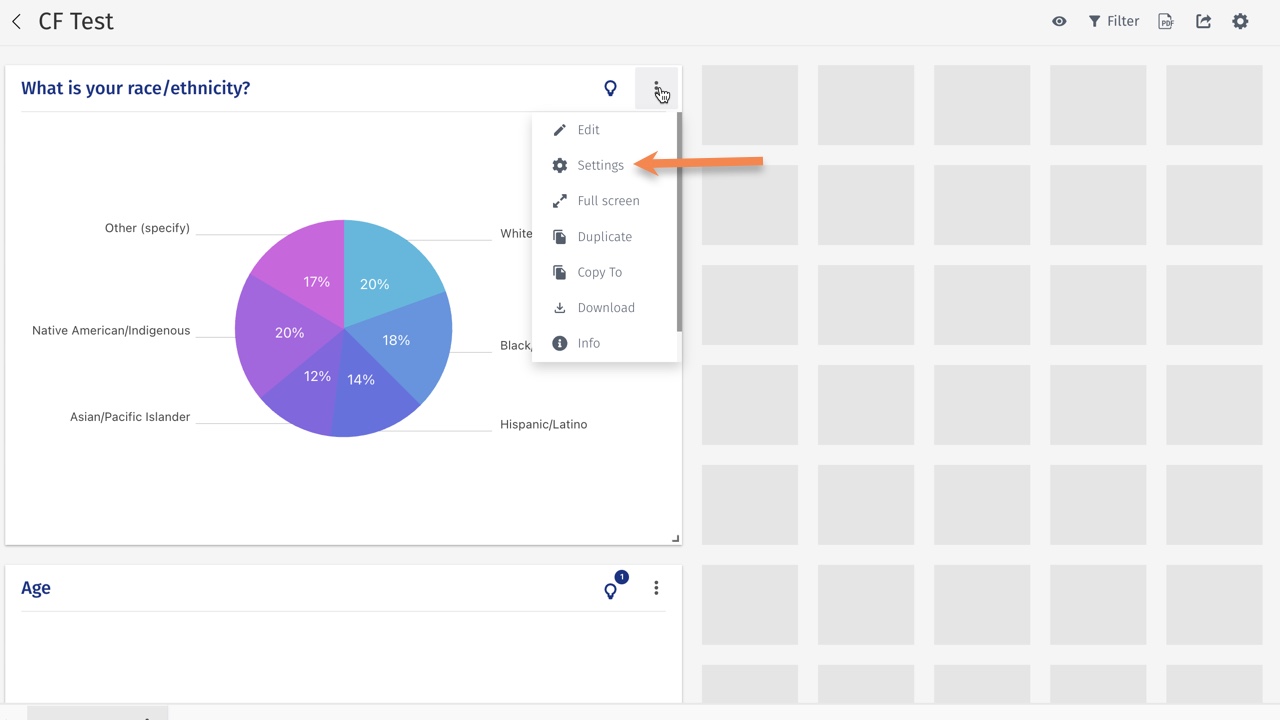
Click on the options of the widget: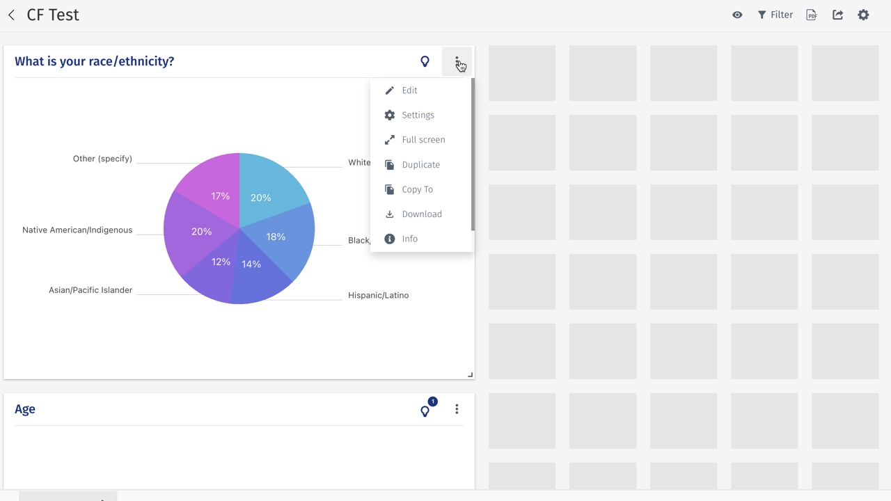 Click on settings:
 Once the general setting are shown, scroll down to access chart elements.
This feature is available with the following licenses :
Team Edition Research Edition Communities Customer Experience Workforce