

- Add widgets
- Survey Comparison
- Heatmap
- Anonymity Settings
- eNPS in Workforce Analytics Portal
- QxBot Assist in Workforce
- Notes Widget
- Text Analysis Widget
- Response rate
- Text Report
- Trend analysis widget
- Show/hide Markers and Building blocks
- Question Filter
- Single Question Widget
- Heatmap default
- Sentiment analysis
- Scorecard
- Driver analysis
- Scorecard: All options view
- Heatmap Custom Columns
- 360 feedback introductory text
- 360 feedback display configurations
- 360 feedback display labels
- Multi Level Priority Logic
- 360 Surveys- Priority Model
- 360 feedback - skip logic
- 360 feedback - show hide question logic
- 360 Survey Settings
- 360 feedback configuration
- Customize the validation text
- 360 Survey design
- 360-Reorder section
- 360 Section Type - Single Select Section
- 360 Delete Sections
- 360 Add Sections
- 360 section type - Free responses text section
- 360 Section Type - Presentations text section
- 360 Section-Edit Configurations
- 360 Survey- Languages
- Matrix section

eNPS in Workforce Analytics Portal
The eNPS widget revamp provides a great amount of additional functionality and ability to view data in more detail. For instance, see the eNPS by any filters you have set up, such as department, location, tenure and more. See the filtered scores broken down into promoters, passives and detractors, while also being able to benchmark them to the overall score.
Here's a glimpse of how it works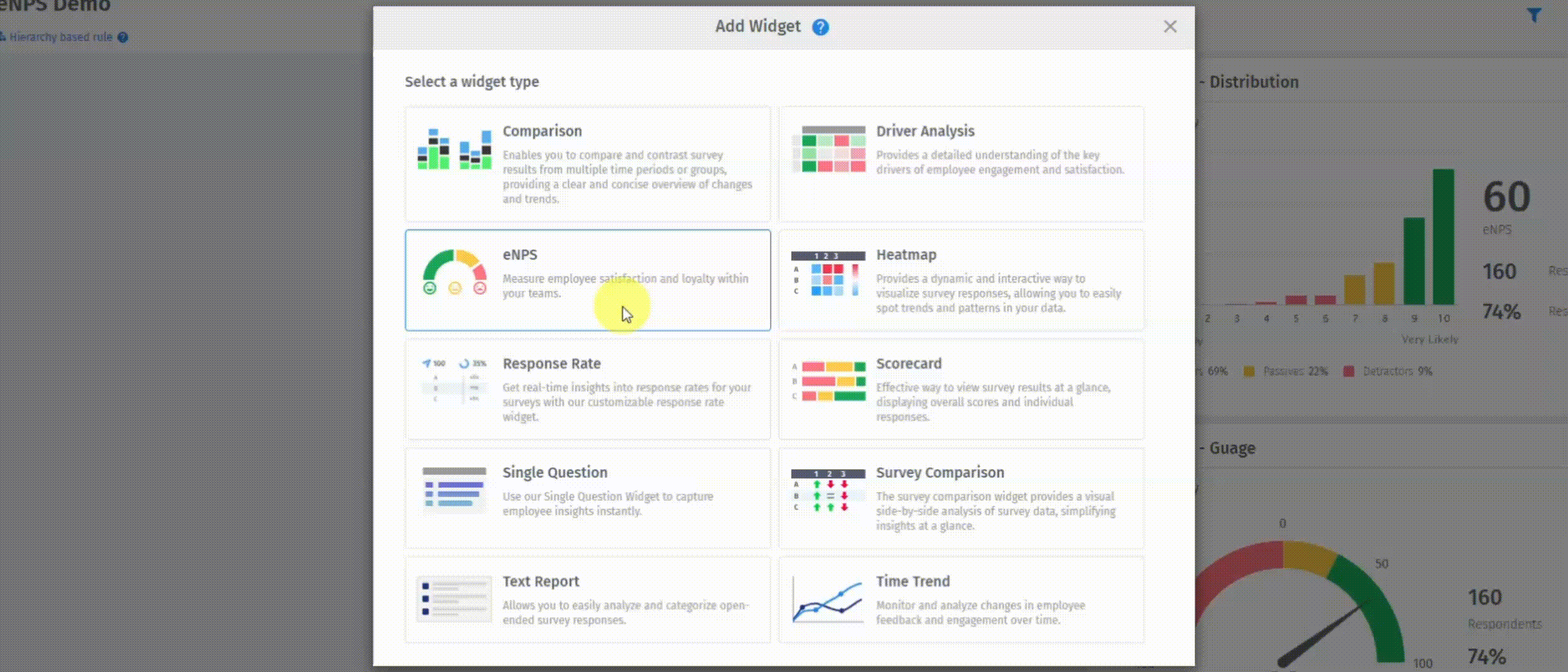 Click to download video
How to add eNPS widget:
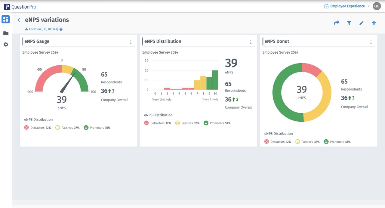
- Go to: Analytics Portal » Employee Experience » Create a Dashboard.
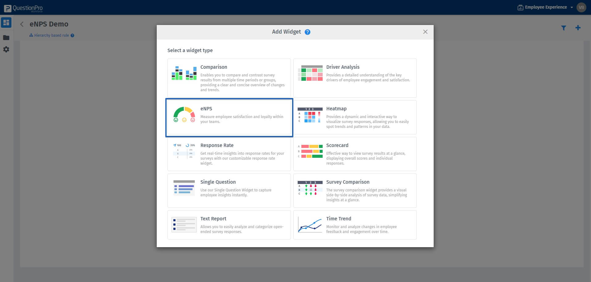
- Click on Add a widget and select eNPS .
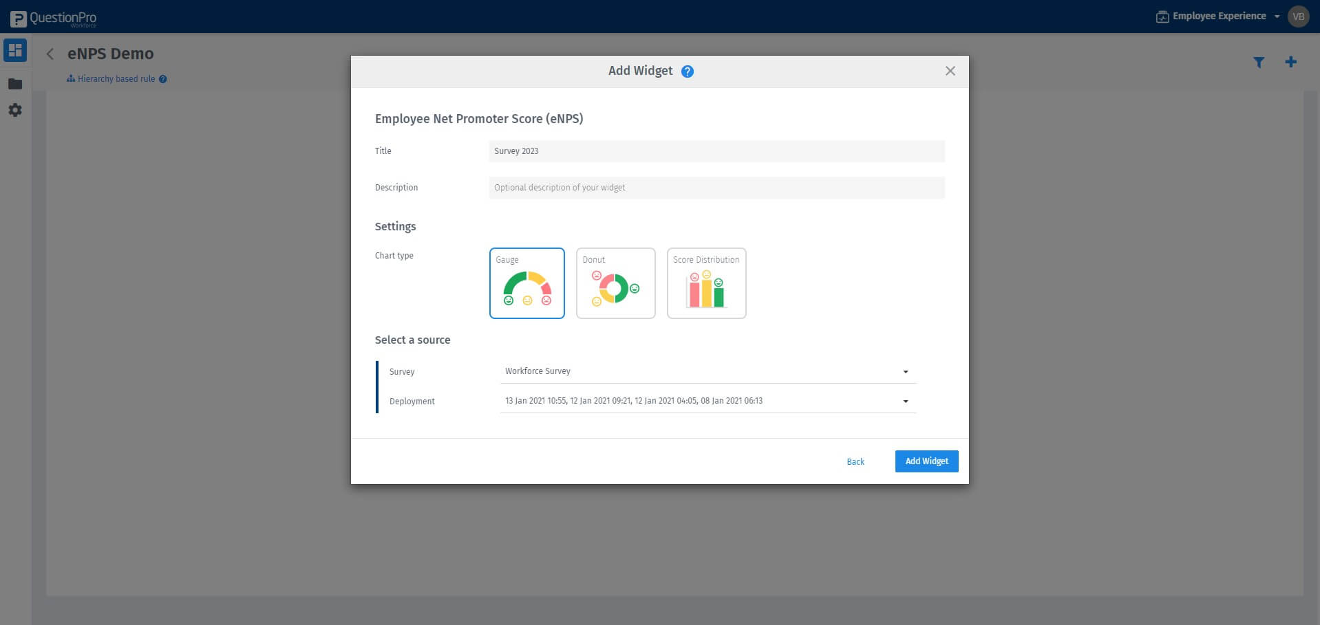
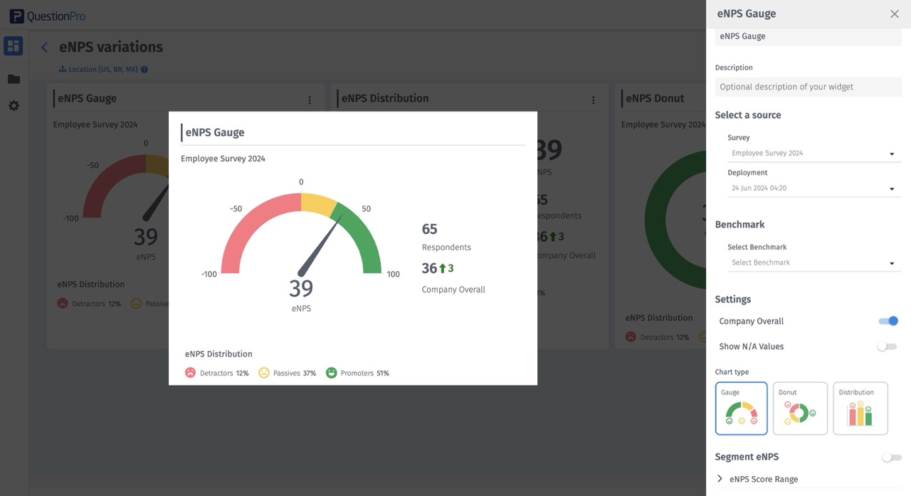
- In pop-up, add widget title, select the chart type, select survey and deployments. Click on Add Widget.
- Your eNPS widget is created on the dashboard.
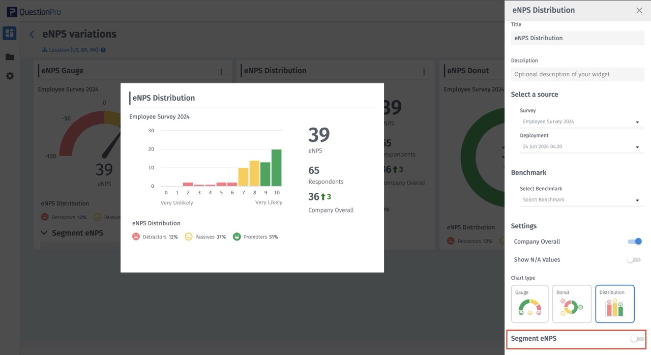
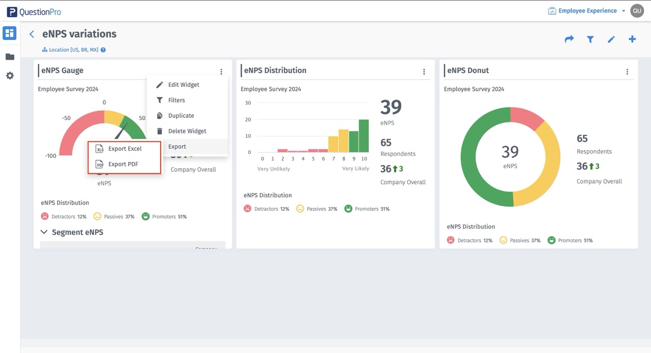
- In kebab option, select Edit Widget. Users can edit the widget, change the chart type and also add segments on the eNPS.
- Segments allow the user to analyse the data as per the set criteria, which are the custom fields from employee roster. It can be department, region, gender and so on.
- In the edit widget, user has the ability to hide the distribution chart.
- The eNPS widget can be created in guage, donut and distribution chart types.
- The eNPS widget can be downloaded in PDF and Excel format.
- You can define the eNPS score ranges according to your own criteria for what is considered a good, average, or poor final score.
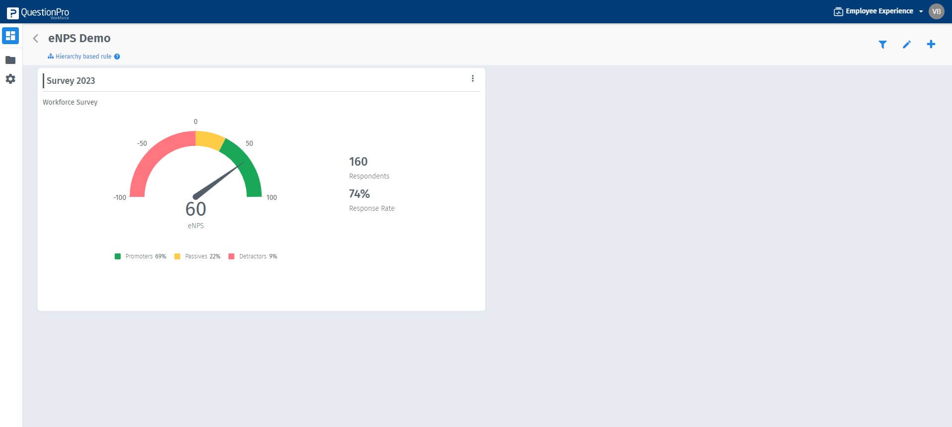
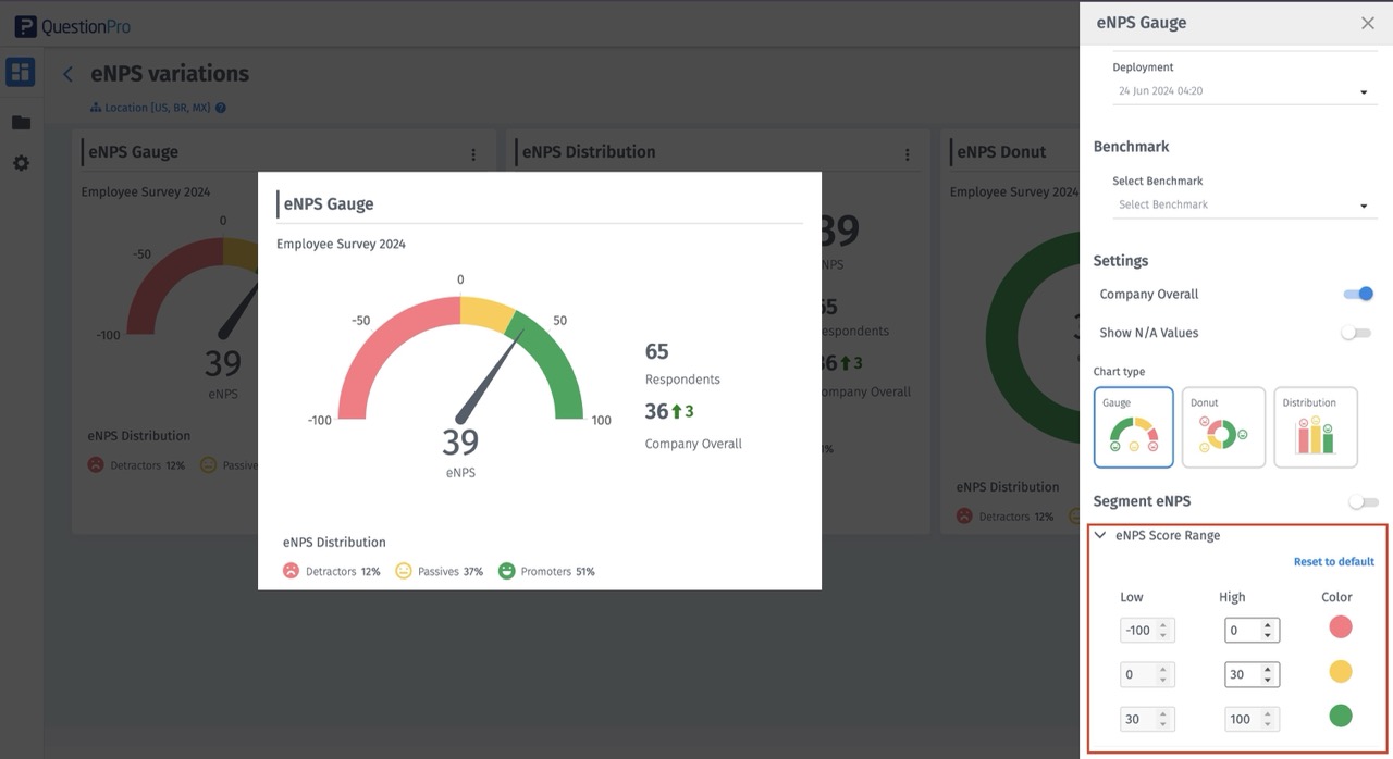
eNPS widget coloring
Range of eNPS can be -100 - 100.
Color coding is divided into promoters, neutrals and detractors.
This is the standard color coding that is followed for NPS
RED/DETRACTORS: -100 to 0
YELLOW/NEUTRALS: greater than 0 - 30
GREEN/PROMOTERS: greater than 30-100
You may also be interested in...
Create Survey - How to?
Add Questions - How to?
Standard Question Types
Multilingual Surveys - How to?