
- Custom Variable Widget
- Priority Matrix
- Heatmap Widget
- Grid Widget
- Weighted mean widget
- Comment List widget
- Widget Filters
- Ranking List Widget
- Distribution Chart
- NPS Widget
- Trend Widget
- Word Cloud Widget
- Cross tab widget
- KPI Comparison Widget
- Bubble chart
- Custom Metric Trend Chart
- Trend Comparison Widget
KPI Comparison Widget
KPI comparison widget helps the CX users to plot comparative charts for various parameters such as segments, products, or closed-ended question options based on supported scoring models. This widget supports NPS, CSAT, count, and custom metric as scoring models. This widget supports Segment, custom variables, product, and close-ended questions chart metrics.
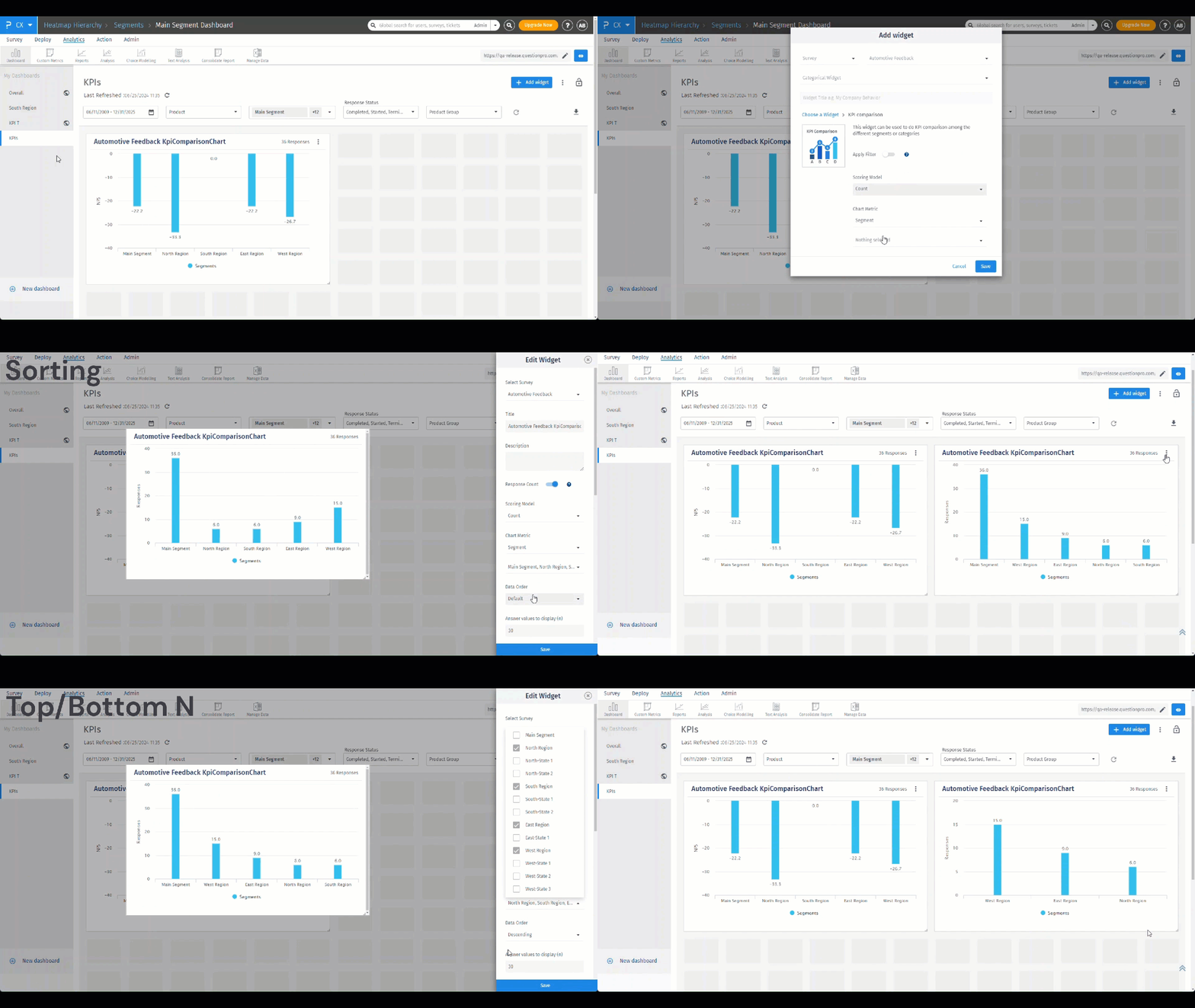
Here is a glimpse of the KPI comparison widget:
 Click to download video
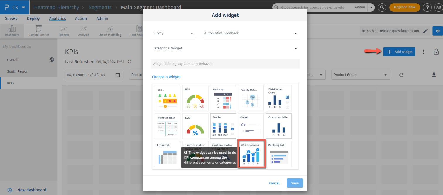
Once you are on the CX dashboard on which you want to add the KPI comparison widget, click on the “+Add widget” button, choose the KPI comparison chart from the available charts.
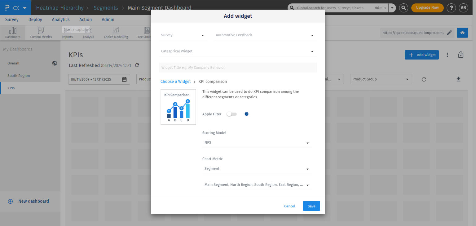
 Select the scoring model, chart metric, and appropriate options to plot the chart.
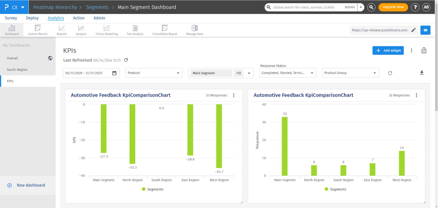
Widget Settings can be accessed by clicking on the three dots in the top right corner and clicking the “Edit” button on the chart. You can choose from the four different sorting options provided under the “Data Order” setting: Default, Ascending, Descending, and Alphabetical.
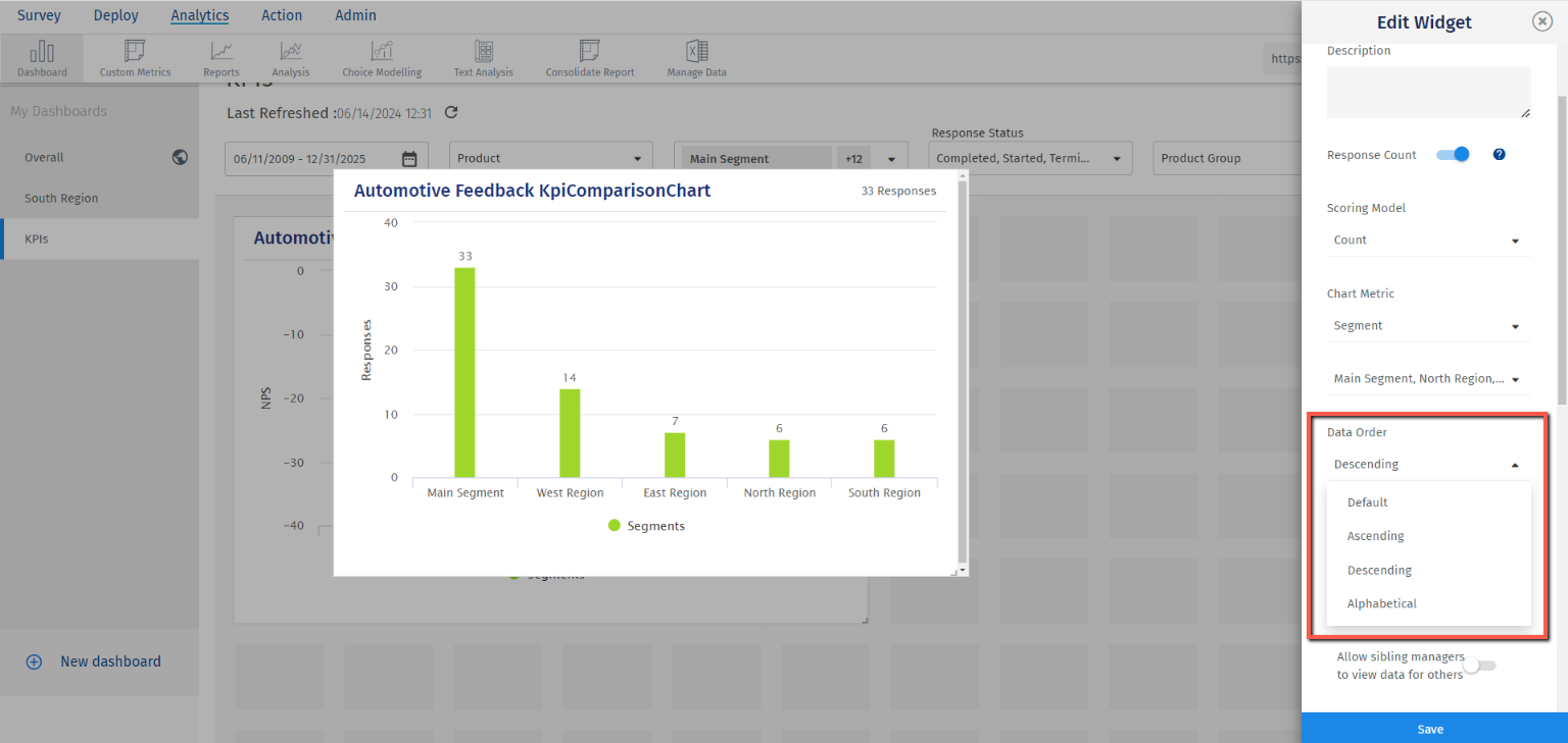 It will sort the data points in the chart as per the data order set.
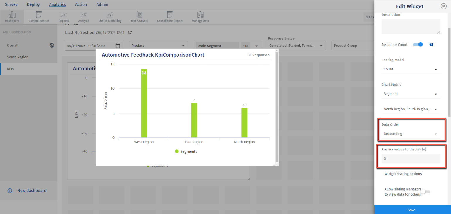
This can be achieved using the combination of “Answer values to display (n)” and “Data order” widget settings. Choose the number of answer values you want to display in the chart in the “Answer values to display (n)” options and if you want to top n (maximum values) then you can choose descending as the data order and vice-versa. This will show you the top n answer options in terms of answer values in the KPI comparison widget.
The “Secondary Level Breakdown” option allows you to add an additional dimension to a KPI Comparison widget, providing deeper insights and better trend analysis. It enhances the existing KPI comparison graph by segmenting the displayed data (e.g., Count, NPS, CSAT, or custom metrics) based on a second dimension.
You can choose from the following chart metrics to apply the secondary breakdown:
- Segment
- Custom Variable
- Product
- Close-ended Questions
- Add a KPI Comparison Widget using your desired chart metric.
- Open the Widget Settings.
- Enable the “Secondary Level Breakdown” toggle.
- A dropdown will appear listing the available metrics (Segment, Custom Variable, Product, or Close-ended Questions). Select the one you'd like to use for further breakdown.
- Once a metric is selected, a list of corresponding values will be shown. Choose the values you want to include in the graph.
- Click Save to apply the changes.
Your widget will now display the KPI data with an added layer of segmentation, helping you uncover more granular insights.
The following three are the key widget-sharing options present in the KPI comparison widget settings: These widget-sharing options are useful while sharing the dashboards with the managers. These options are accessible only to the admin of the account. Multiple toggles can be used simultaneously as per the requirement.
- Allow sibling managers to view data for others – When turned on, managers will be able to see columns of their sibling managers (managers from the same segment only) along with their data columns.
- Allow managers to view data for parent segment – When turned on, managers will be able to see columns of their parent segment along with their data columns.
- Share main segment data – When turned on, managers will be able to see the main segment column in addition to their columns.
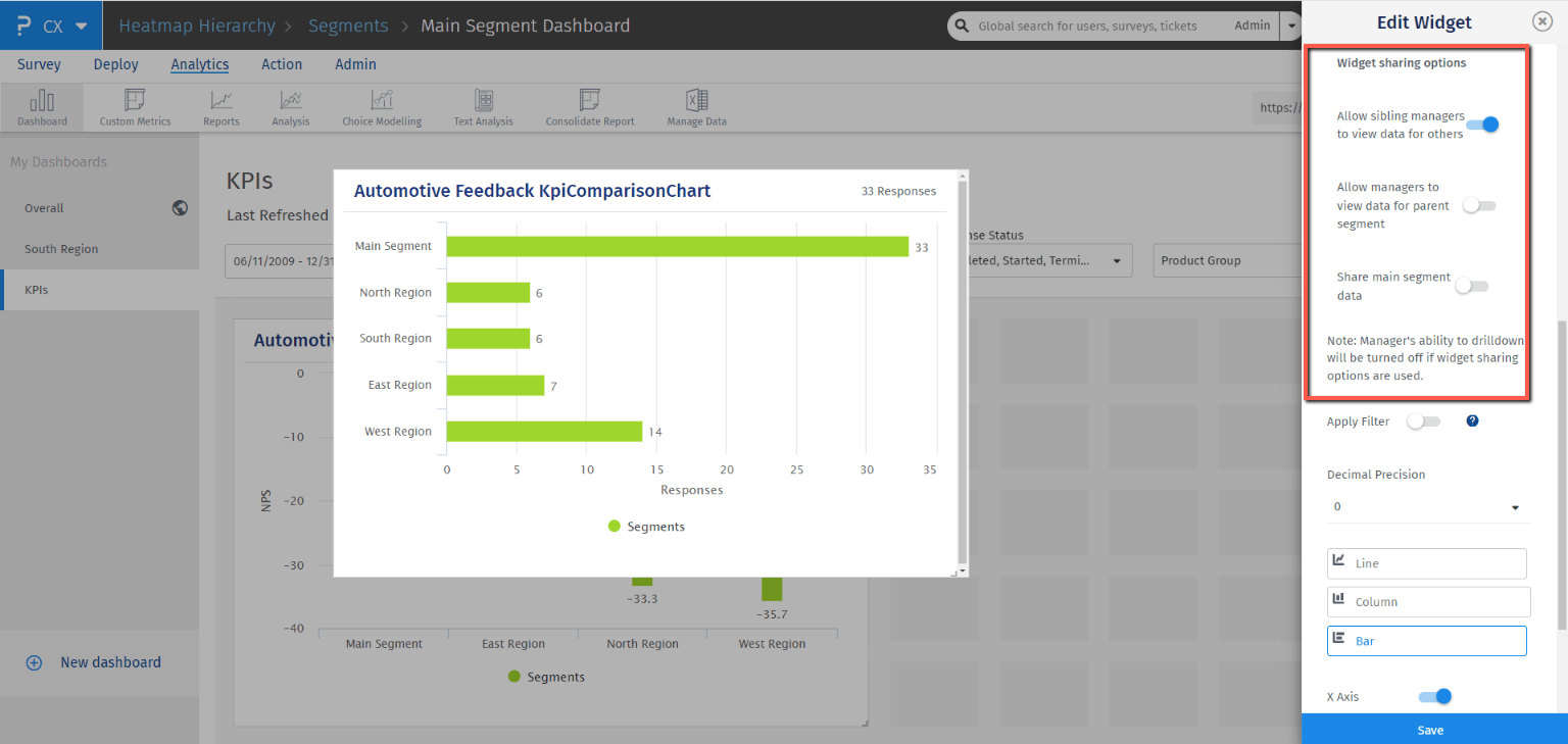
Bar, column, and line are the three types of charts that can be plotted in the KPI comparison widget.
View marketing video
