
- Custom Variable Widget
- Priority Matrix
- Heatmap Widget
- Grid Widget
- Weighted mean widget
- Comment List widget
- Widget Filters
- Ranking List Widget
- Distribution Chart
- NPS Widget
- Trend Widget
- Word Cloud Widget
- Cross tab widget
- KPI Comparison Widget
- Bubble chart
- Custom Metric Trend Chart
- Trend Comparison Widget
Bubble chart
This chart is the same as the sentiment analysis chart where the bubbles represent various major themes (keywords) identified by the natural language processor. These bubbles have divided distributions of sentiments as positive, neutral, and negative.
Here the size of the bubbles represents the occurrences or mentions of that respective theme.
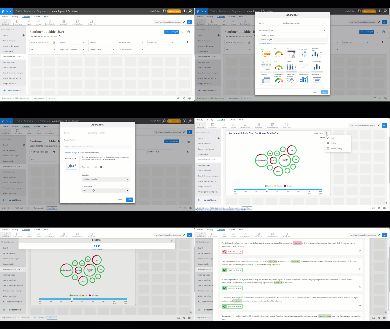
Here is a glimpse of the bubble chart widget:
 Click to download video
- Once you are on the CX dashboard where you want to add the sentiment bubble chart, click on the “+ Add widget” button.
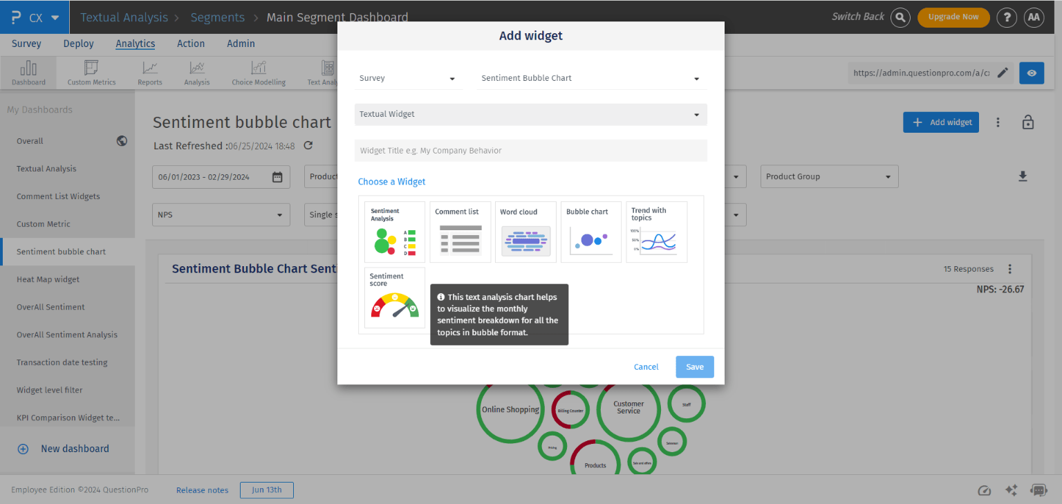
- Select the appropriate survey and change the widget type to textual widgets.
- From the provided textual widgets select the “Bubble chart” widget and on the next screen select the question for which you want to plot the bubble chart.
- Click on the “Save” button.
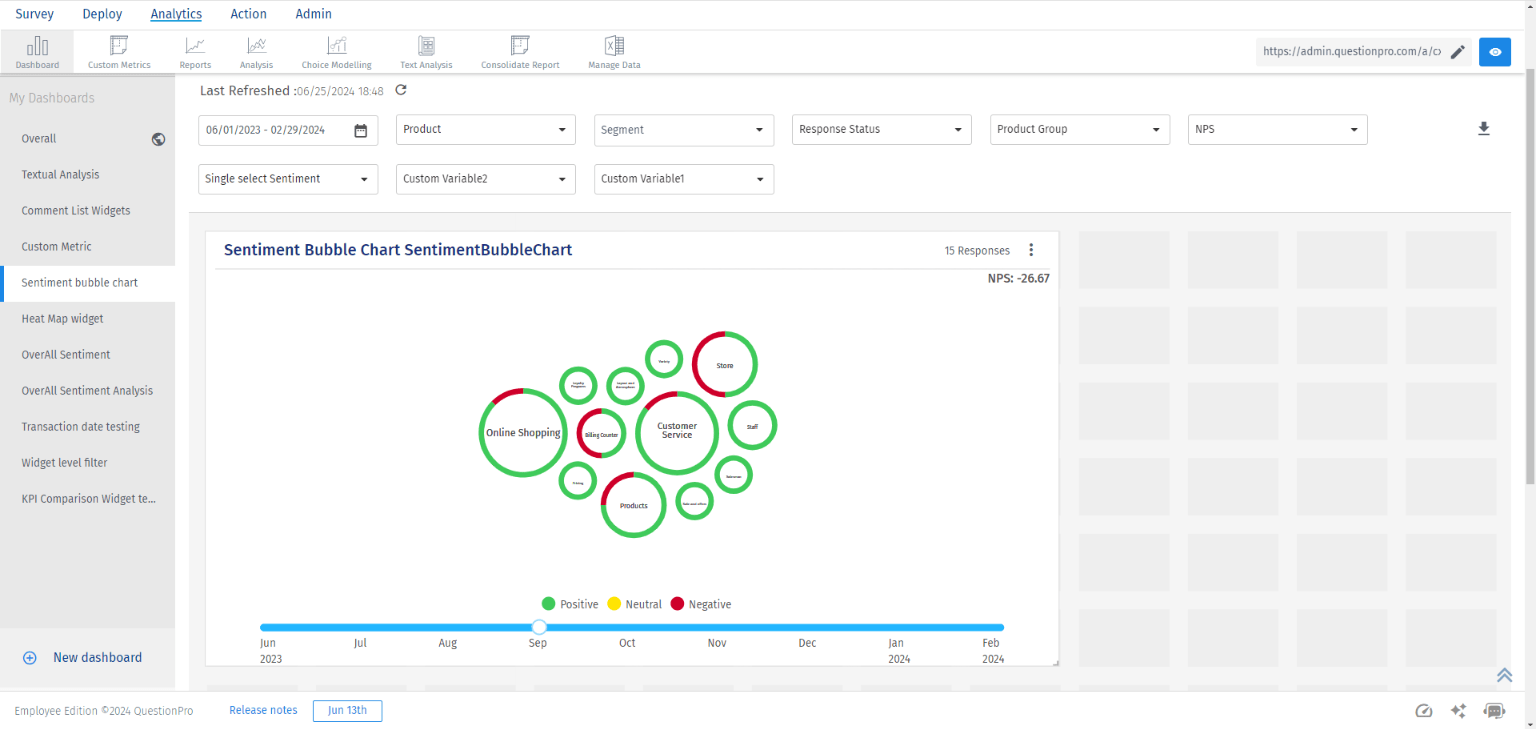
A step slider is provided in the chart using which you can choose the month for which the bubble chart must be shown.
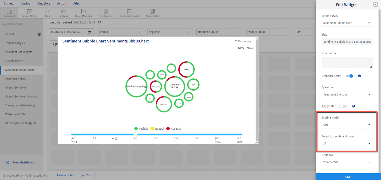
By using this setting you can set the number of sentiment bubbles to be added to the chart. The system will sort the sentiment bubbles based on their mentions and show only the top (based on the setting) sentiment bubbles in the chart.
The KPI score (either NPS or CSAT whichever is set) for the respective month will be shown in the chart.
By clicking on each of the bubbles you can see the comments which are analyzed by the textual analysis engine to derive the sentiment of that respective bubble (theme).
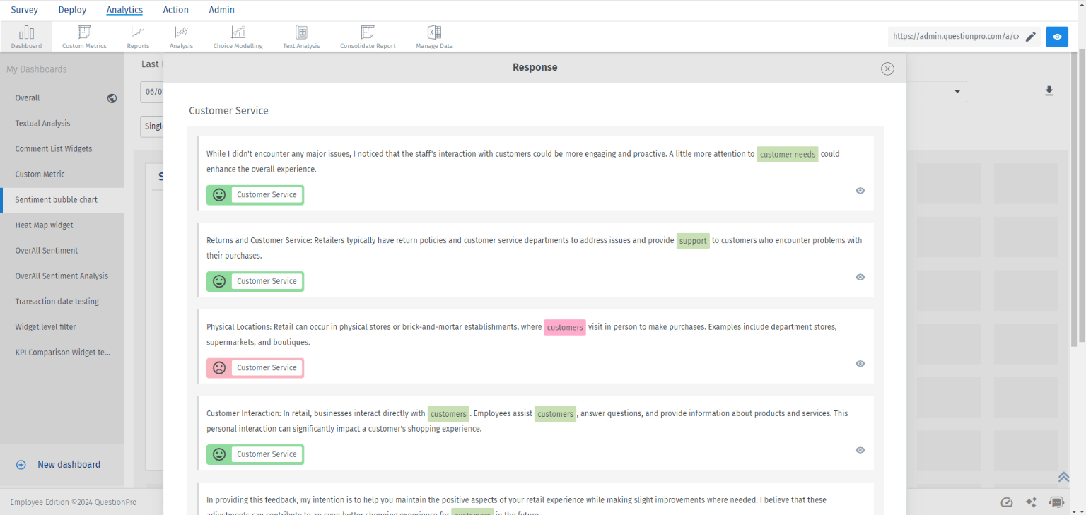 Drilldown action can be turned on from the widget settings by setting the “Drilldown” setting as “Do nothing”.

