- Custom Variable Widget
- Priority Matrix
- Heatmap Widget
- Grid Widget
- Weighted mean widget
- Comment List widget
- Widget Filters
- Ranking List Widget
- Distribution Chart
- NPS Widget
- Trend Widget
- Word Cloud Widget
- Cross tab widget
- KPI Comparison Widget
- Bubble chart
- Custom Metric Trend Chart
- Trend Comparison Widget
Analytics
In the Analytics section of CLF, users are presented with a comprehensive overview of their performance and the performance of their team. The following graphs and charts are included:
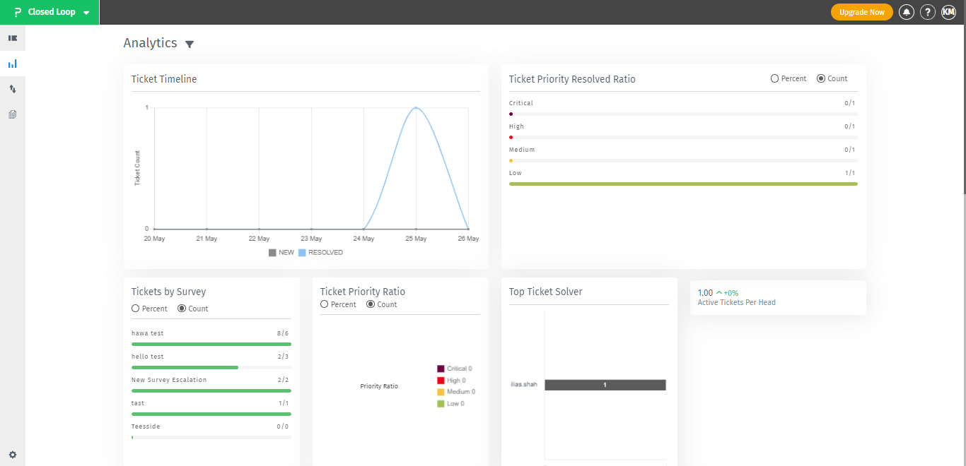
- Ticket Timeline Graph: A visual representation of the number of new and resolved tickets over a given period of time.
- Ticket Priority Resolved Ratio Graph: This graph displays the ratio of resolved tickets based on their priority in both percentage and count.
- Tickets by Survey Graph:This graph provides a visual representation of the feedback received from customers regarding the ticket resolution process in both percentage and count.
- Top Ticket Solver Graph:This graph showcases the top assignee names in terms of resolved tickets.
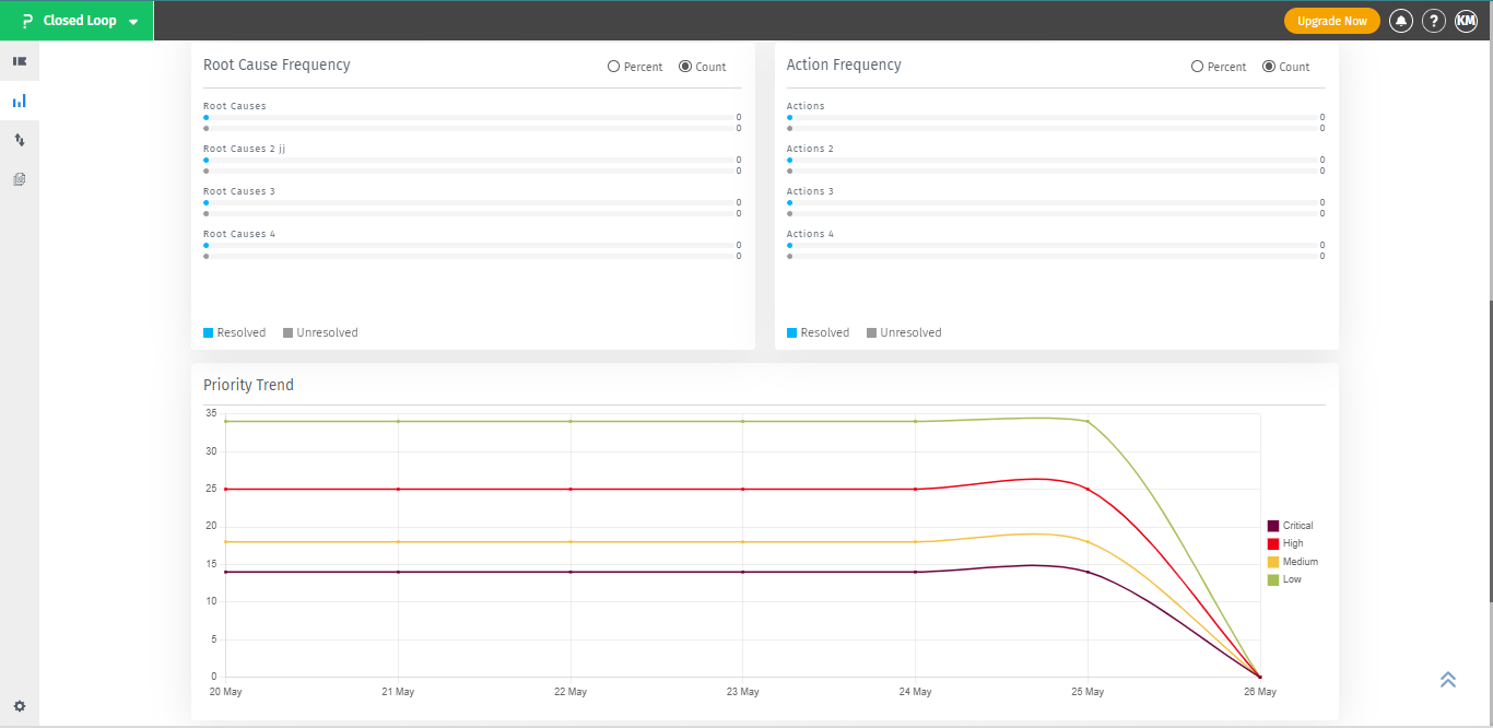
- Root Cause Frequency:This graph displays the frequency of the root causes of tickets in terms of both percentage and count.
- Action Frequency:This graph shows the frequency of actions taken to resolve tickets in terms of both percentage and count.
- Priority Trend Graph:This graph represents the trend of ticket priority over a given period of time.
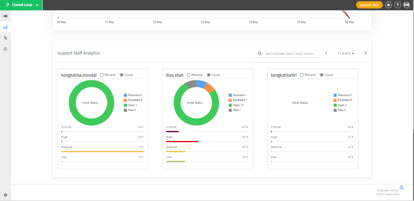
- Support Staff Analysis Graph:This graph displays an analysis of the performance of support staff in terms of ticket resolution. Basically for this term, the user needs to select the feedback very first, from the filter option.


 These graphs and charts help the user to identify strengths and weaknesses, track progress, and make informed decisions to improve the ticket resolution process and overall customer satisfaction.
To get the best report from the CLF analytics dashboard, a user can utilize the following steps:
- Choose the specific feedback and segment from the filtering option, based on the requirement.
- Select the desired date range or assignee to narrow down the report.
- Utilize the available graphs, such as the Ticket Timeline, Ticket Priority Resolved Ratio, Tickets by Survey, Top Ticket Solver, Root Cause Frequency, Action Frequency, Priority Trend, and Support Stuff Analysis, to understand the performance of the team and the tickets.
- Analyze the data presented in the graphs to identify any trends or patterns.
- Use the information to make informed decisions and take action to improve the ticket-handling process.
To provide users with meaningful and actionable insights, our analytics dashboard offers the ability to apply filters. By filtering the data, users can focus on the last 7 days and specifically analyze feedbacks, ensuring clarity and relevance. Additionally, filtering allows users to access support staff analysis results without any ambiguity, as feedback and segments can be precisely specified. Empower yourself with a customized view, harness the full potential of our analytics dashboard, and unlock the true value of your data-driven decision-making.

