
- Custom Variable Widget
- Priority Matrix
- Heatmap Widget
- Grid Widget
- Weighted mean widget
- Comment List widget
- Widget Filters
- Ranking List Widget
- Distribution Chart
- NPS Widget
- Trend Widget
- Word Cloud Widget
- Cross tab widget
- KPI Comparison Widget
- Bubble chart
- Custom Metric Trend Chart
- Trend Comparison Widget
Dashboard charts
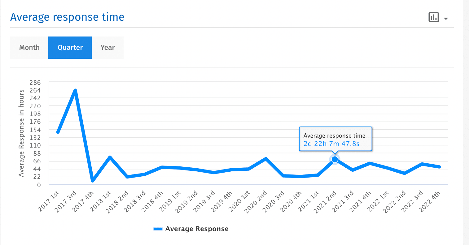
Average response time
- It calculates the difference between the time the review was posted and the time when a reply was added to the review.
- By default the average response time shown is for the last month(last 30 days).

Total reviews
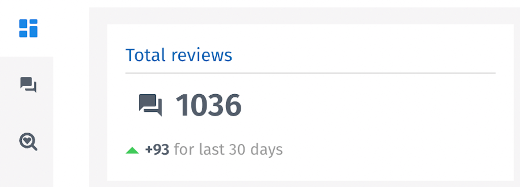
- Displays the total number of reviews, depending on the filters applied
- It also shows the total number of reviews for the last month (last 30 days).
Overall rating
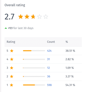
- It calculates the average of the ratings received across the review sources added in the CX Reputation platform
- There is also a table with 3 columns where the first column shows the star rating, the second column is the counter that counts reviews, and the third column is the percentage of reviews.
- It also shows the overall rating for the last month (last 30 days).
Overall rating with filters
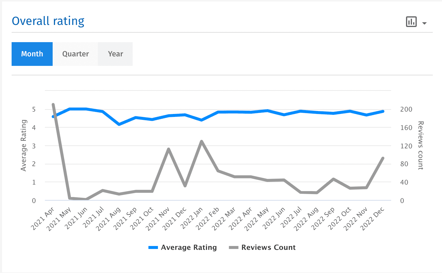
- It calculates the average of the ratings received across the review sources added in the CX Reputation platform
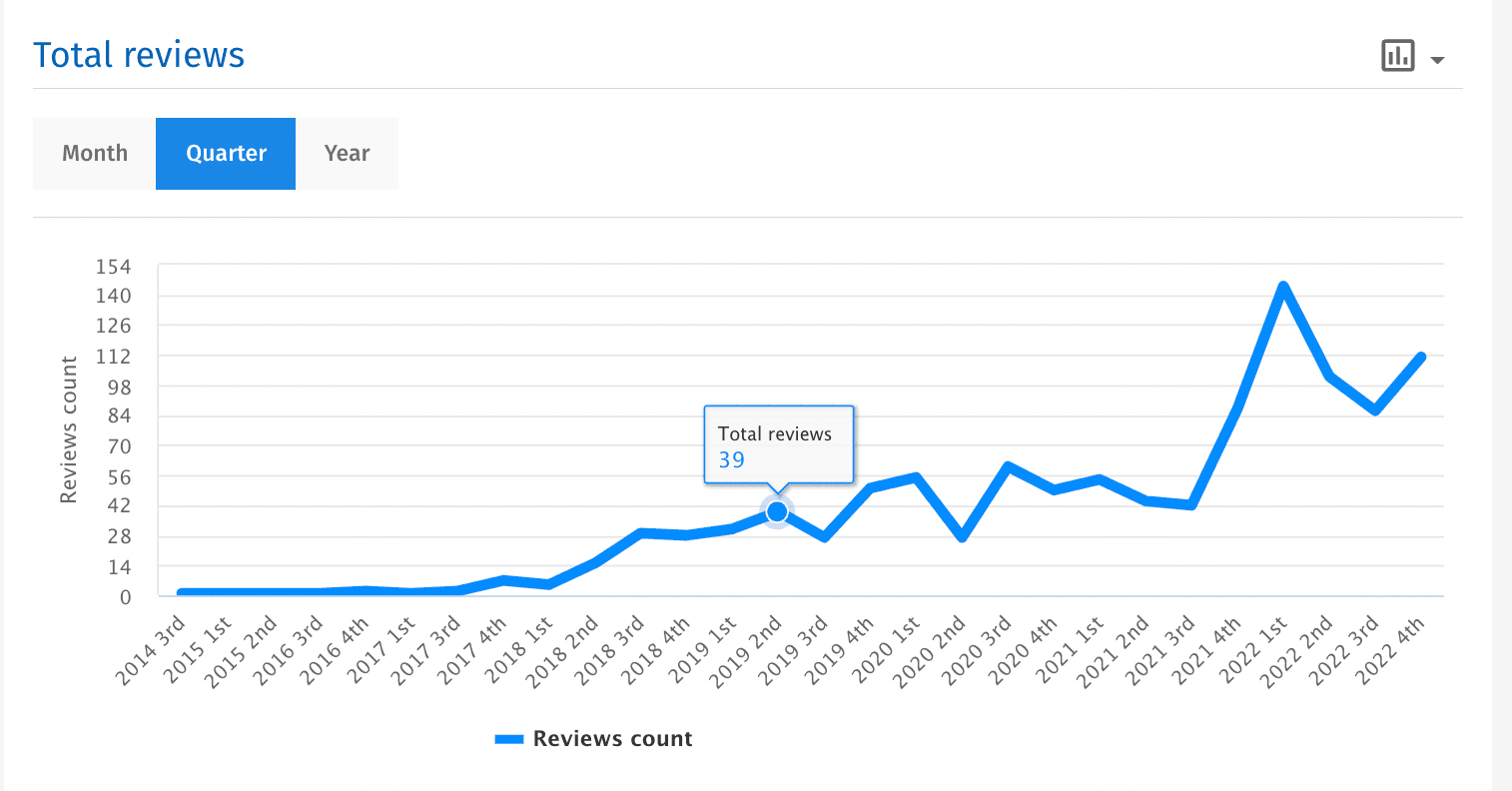
- You can select for Month, Quarter or Year to display the overall rating
- This widget can also be used to represent Total number of reviews and Average response time in a line graph.
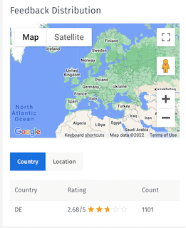
Feedback distribution chart
- Map presentation of the reviews. It bifurcates the reviews Information based on country, star rating and total number of reviews.
- Click on the Location tab if you want to see information depending on locations.
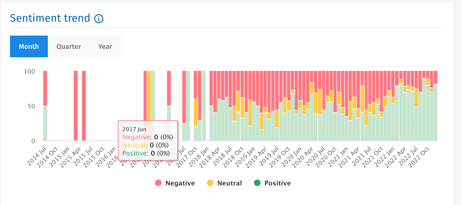
Sentiment trend chart
- It displays the percentage of positive, negative and uncategorized (neutral) topics found.
- Click on the Month tab if you want to view it in Months. You can also further drill down the results for quarter or year.
- If you want to display only the positive trend, just click on the negative and neutral legend and they will be removed.
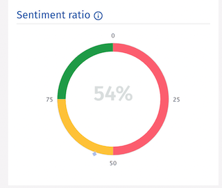
Sentiment ratio chart
- It displays the percentage of positive sentiments.
Sentiment topics chart
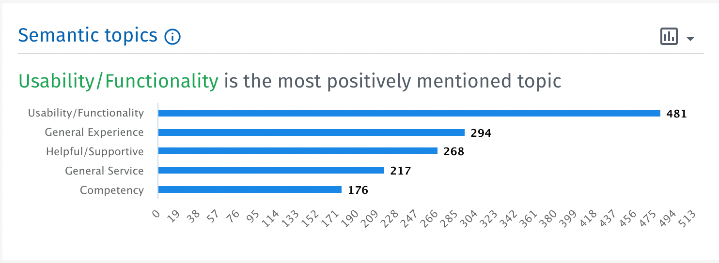
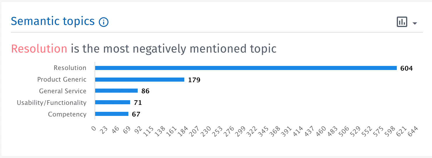
- Displays five most common positive and negative topics. If a review has the same topic twice, it will be counted as one for the purpose of this chart.
- If you want to see negative topics, you can click on the drop down available at the top right corner of the widget.
- Positive Topics
- Negative Topics
Word cloud chart
- Word Clouds are a powerful way to visualise what your customers are really thinking about . They are easy to read, quick to produce and simple to understand.
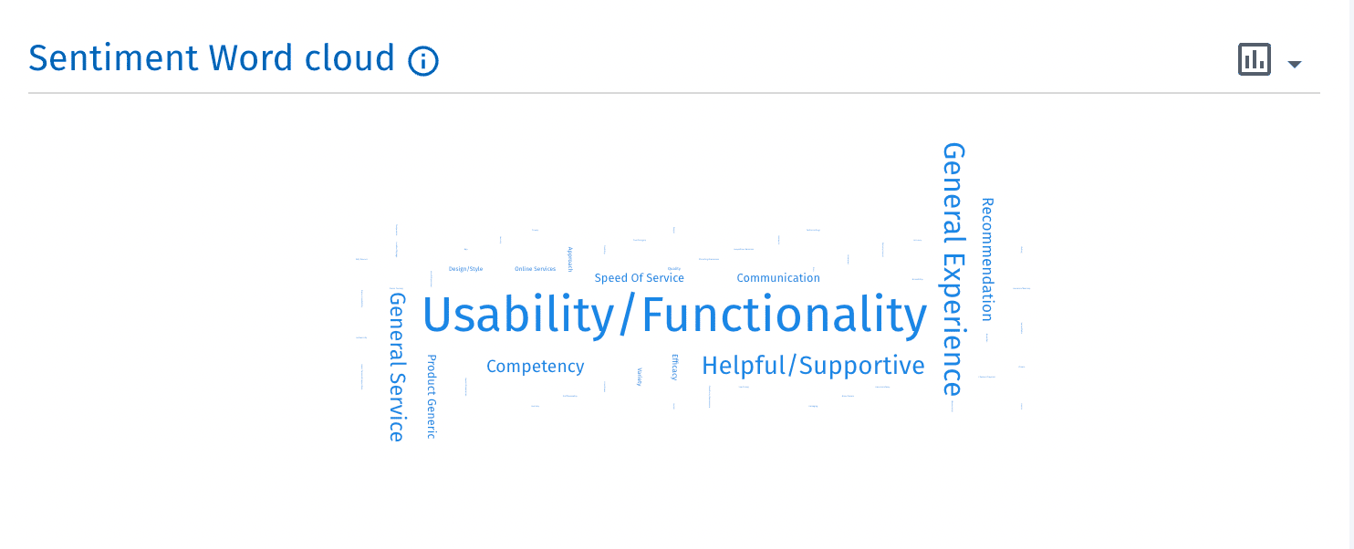
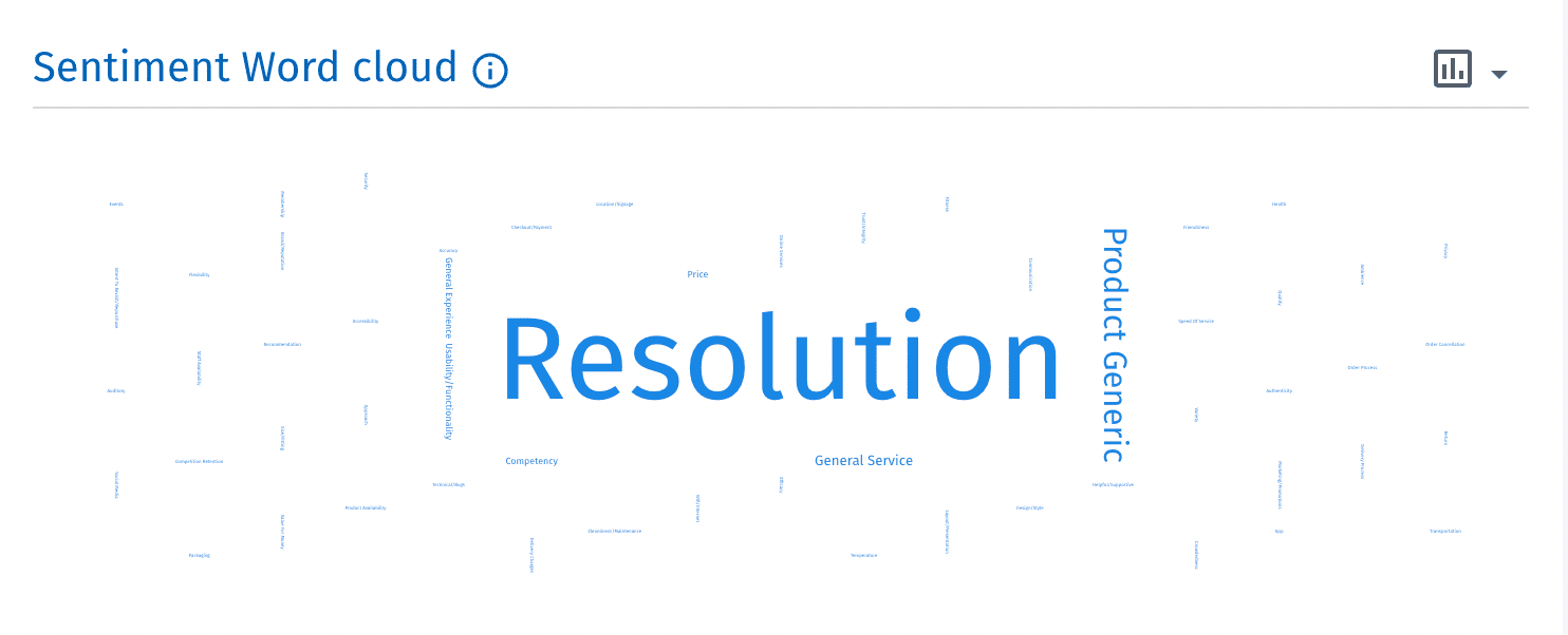
- This will enable the user to visualize the positive and negative sentiment trend in word cloud format.
- Depending on the frequency of the sentiment topic the words will be highlighted and the number of occurrences of those words in the reviews will be displayed to the user.
- If you want to see negative topics, you can click on the drop down available at the top right corner of the widget.
- Word cloud for positive sentiment topics
- Word cloud for negative sentiment topics
Trustscore widget
- The Trustscore widget is available only with the Trustpilot integration. It displays the trustscore that is propietary to the Trustoliot reviews. The formula used is different. Check the link.
- The Trustscore and Overall rating are different, reason being, the way both are calculated varies. Check the Overall Rating widget section for more details.
- This widget will only be available if the Trustpilot integration is installed.
- If you do not apply any dashboard filters, and Trustpilot integration is installed, then this chart if visible. If you apply a source filter and do not select Trustpilot as a source, this widget will not be visible.

You may also be interested in...

