- Custom Variable Widget
- Priority Matrix
- Heatmap Widget
- Grid Widget
- Weighted mean widget
- Comment List widget
- Widget Filters
- Ranking List Widget
- Distribution Chart
- NPS Widget
- Trend Widget
- Word Cloud Widget
- Cross tab widget
- KPI Comparison Widget
- Bubble chart
- Custom Metric Trend Chart
- Trend Comparison Widget
CX-Dashboard
A dashboard is a graphical representation of your data often providing an at-a-glance view of key performance indicators relevant to a particular objective or business process. Designed for versatility, our dashboards allow users to effortlessly add and customize multiple widgets, such as charts and graphs. With robust filtering options based on various parameters and variables, you can fine-tune your data analysis to uncover meaningful insights. Additionally, our dashboard supports seamless exportation in multiple formats, ensuring that your insights can be shared and utilized across different platforms with ease.
A CX dashboard is a visual display of responses to your survey present in the respective workspace.
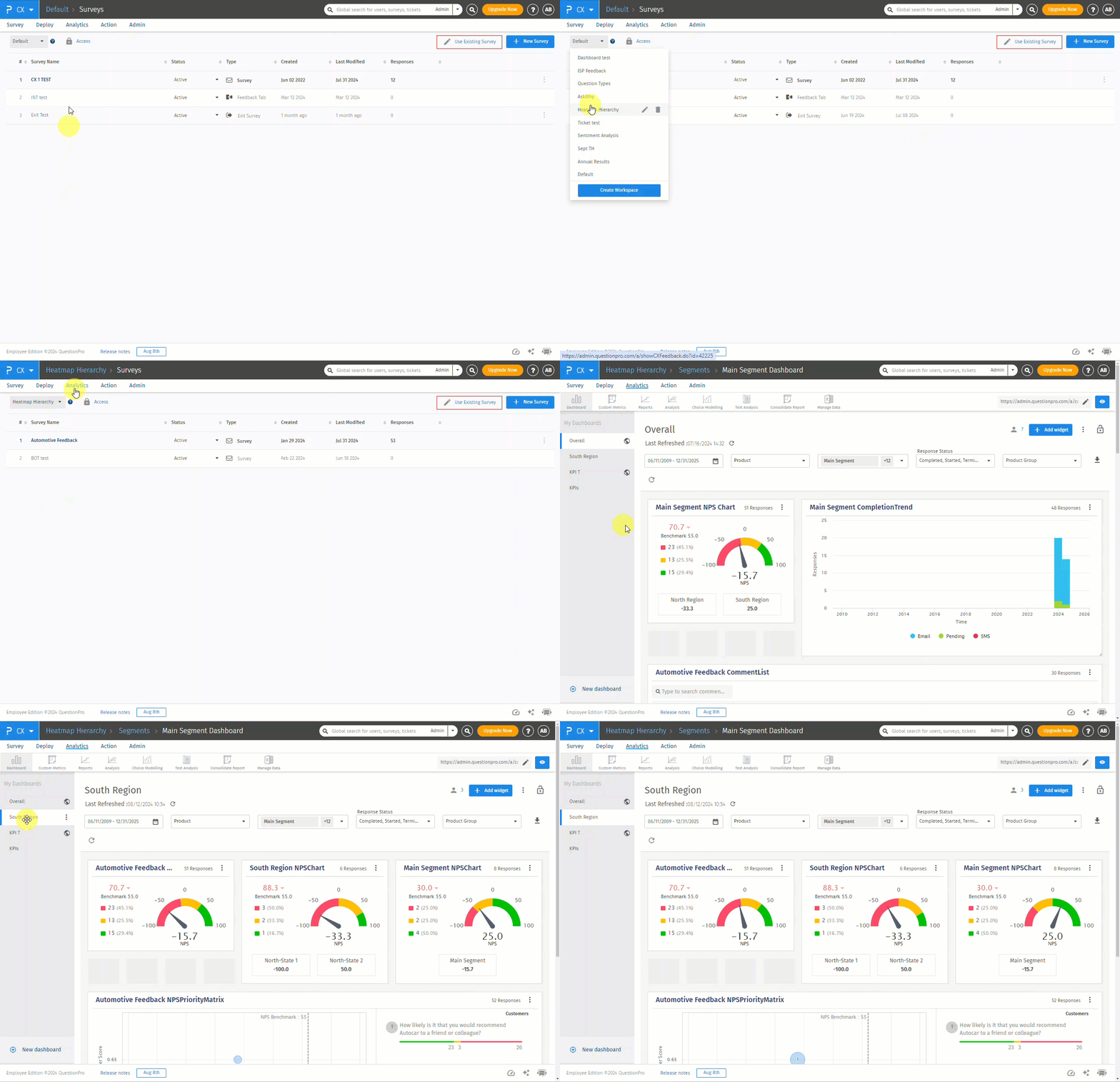
Here is a glimpse of the CX-Dashboard:
 Click to download video
Go To: Login >> Customer Experience >> Analytics >> Dashboard

The system by default adds a few widgets to the dashboard namely, the NPS chart, NPS trend chart, completion rate chart, completion trend chart, and NPS comparison chart.
There are by default three basic filters which you can use i.e. segment filter, response status filter and date filter.

- Segment: You can filter the data for all the segments.
- Response Status: Apply the filter based on Survey status for All, Started, Completed or Terminated.
Every survey result can be classified into three different categories:
- Started But Not Completed - Users who have clicked on the "Continue" button but have not completed the survey so far.
- Completed - Users who have completed the survey
- Terminated - If you have branching logic for termination (screen outs) these responses are flagged as terminated
- Date: You can apply 1 filter for date
- System Variable:You can add upto 50 filters. You just need to add custom variable mapping in Login >> Customer Experience >> Admin >> Mapping. Also, most important part is to make sure to enable analytics. Then you will be able to filter the dashboard on the basis of custom variables.

Yes, you can combine more than one filters.
Here is the list of terms that will occur when you will proceed further.
- Dashboard - A Dashboard is a visual display of responses to your survey. Dashboard gives you the statistic of your survey like Viewed, Started, Completed and Drop Outs counts.
- Widget - Widget is in which the graphs, charts, and other visualizations are represented.
- Segment - A segment can be explained as your business entities, which you map into the system.
- Responses - Responses that are collected for your surveys

